Learn how to make your fonts look great on every screen with responsive typography. Discover expert tips on scalable fonts, CSS techniques, and improving readability across devices.

In the world of web design, first impressions matter. And while colors, layouts, and images all play important roles, typography is often the unsung hero that ties everything together. Responsive typography ensures that your content remains legible, beautiful, and accessible—no matter what device your audience is using.
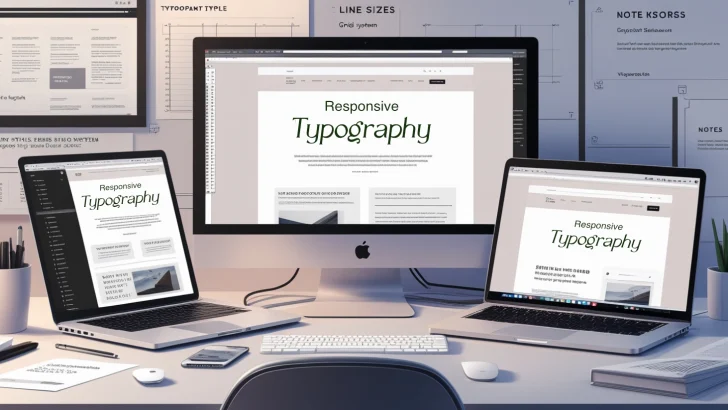
Let’s dive into why responsive typography matters, and how you can implement it to make your fonts shine on every screen size.
What Is Responsive Typography?
Responsive typography refers to the practice of designing and scaling text to adapt fluidly to different screen sizes and resolutions. From smartphones to large desktops, the goal is to maintain readability, visual hierarchy, and aesthetic harmony without requiring the user to zoom or scroll awkwardly.
It’s not just about making text bigger or smaller—it’s about maintaining balance, usability, and consistency.
Why Responsive Typography Is Important
-
Improved Readability: Properly scaled fonts reduce strain on the eyes and make reading on screens more comfortable.
-
Better User Experience (UX): Typography that adjusts smoothly creates a seamless and professional feel, enhancing trust and engagement.
-
Accessibility: A responsive font system helps users with visual impairments or those using assistive technology navigate your site more easily.
-
SEO Advantages: Search engines reward well-structured, readable content. Responsive design (including typography) contributes to lower bounce rates and higher dwell times—both positive SEO signals.
Key Principles of Responsive Typography
1. Use Relative Units (em, rem, %, vw)
Avoid fixed units like px and opt for scalable units like:
-
emandrem– based on parent or root font size. -
vw– relative to the viewport width. These units adapt more flexibly across screen sizes.
2. Fluid Typography with CSS Clamp()
The clamp() function in CSS allows you to set a minimum, ideal, and maximum font size:
This lets text scale naturally without breaking the layout.
3. Maintain Line Length and Height
-
Optimal line length: 50–75 characters per line.
-
Line height: Use
1.4–1.6for better readability. Keeping these in check ensures that text feels comfortable, especially on narrow or wide screens.
4. Use Media Queries Thoughtfully
Set font adjustments at specific breakpoints:
This provides fallback control where fluid scaling might not behave ideally.
5. Hierarchy and Scale
Create a clear type hierarchy using a scale (like modular scale):
-
Headings (
h1,h2, etc.) should scale in proportion to body text. -
Use
remunits to link heading sizes to the root font size.
Responsive Typography in Popular Frameworks
Many CSS frameworks now include responsive typography features out of the box:
-
Tailwind CSS: Utilities like
text-base,md:text-lg,xl:text-xlmake it easy to scale fonts across breakpoints. -
Bootstrap: Use classes like
fs-1,fs-2, or define your own with responsive utility classes.
Best Practices
-
Test on Real Devices: Use browser tools, but also check your site on actual smartphones, tablets, and desktops.
-
Avoid Too Many Fonts: Stick to 1–2 typefaces for consistency.
-
Contrast Matters: Ensure your text stands out from the background, especially on smaller screens or in dark mode.
-
Don’t Rely Solely on Viewport Units: Combine strategies to handle extreme screen sizes gracefully.
Conclusion
Responsive typography is not just a “nice to have”—it’s a critical element of modern web design. By ensuring your text is legible and attractive on every device, you create a more accessible and enjoyable experience for your users.
With the right techniques, from CSS clamp() to thoughtful scaling, your typography can adapt beautifully across screens, helping your brand stand out and your content shine.