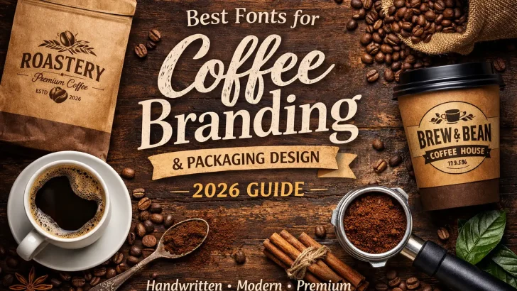
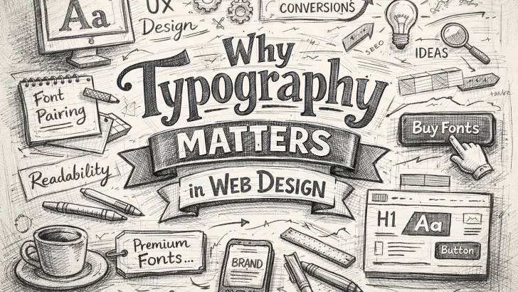
Explore the fascinating history of typography, from Gutenberg’s printing press to modern digital fonts. Learn how typography has evolved and shaped the way we communicate. Typography is the art and technique of arranging type to make written language legible, readable, and visually appealing. Its history is a fascinating journey that spans centuries, from the invention …

The Psychology of Fonts: How Typography Influences User Behavior
Discover how the psychology of fonts influences user behavior. Learn how to use typography to evoke emotions, build trust, and guide decision-making in your designs. Typography is more than just a design element—it’s a powerful tool that can shape how users perceive and interact with your content. The fonts you choose can evoke emotions, convey …

Why Typography Matters in Web Design: Key Tips for Better UX
Typography is more than just choosing pretty fonts—it’s a critical component of web design that directly impacts user experience (UX). The way text is presented on a website can influence readability, accessibility, and even the emotional response of visitors. In this article, we’ll explore why typography matters in web design and share key tips to …

Best Fonts for Poster Design: How to Make Your Message Stand Out
Discover the best fonts for poster design and learn how to choose the perfect typeface to make your message stand out. Explore bold, elegant, and creative font options for your next project. Posters are a powerful medium for communication, whether you’re promoting an event, advertising a product, or sharing important information. One of the most …

5 Tips for Pairing Fonts to Create More Attractive Designs
“Discover 5 essential tips for pairing fonts to create more attractive designs. Learn how to combine serif and sans-serif fonts, use contrast, and match the mood for stunning results.” Font pairing is an essential skill in design that can make or break the visual appeal of your project. Whether you’re designing a website, poster, or …

Futura: The Geometric Font That Defined Modernism
Discover the history and impact of Futura, the geometric sans-serif font that defined modernism. Learn how its clean, functional design continues to inspire designers today. In the pantheon of typefaces, Futura stands out as a defining symbol of modernism. Designed by Paul Renner in 1927, this geometric sans-serif font embodies the principles of the Bauhaus …

The Role of Typography in Famous Brand Logos: How Fonts Define Brand Identity
Discover how typography shapes the identity of famous brand logos. Learn why fonts matter in branding and explore iconic examples like Coca-Cola, Google, and Disney. When you think of iconic brands like Coca-Cola, Google, or Disney, one of the first things that comes to mind is their distinctive typography. Typography plays a crucial role in …

Typography in Layout Design: Choosing the Right Fonts for Impact
Discover how typography influences layout design. Learn how to choose the right fonts, improve readability, and enhance visual impact in your designs. Introduction Typography is a fundamental element of design that plays a crucial role in shaping user experience and brand identity. The right font choices can enhance readability, create visual hierarchy, and convey the …

The Legacy of Gill Sans: A British Typeface That Shaped Modern Design
Explore the legacy of Gill Sans, the iconic British typeface designed by Eric Gill. Discover its history, design features, and enduring influence on modern design. In the world of typography, few fonts have left as indelible a mark as Gill Sans. Designed by the British artist and typographer Eric Gill in the 1920s, Gill Sans …

How Color Psychology Influences Famous Brand Logos: The Power of Colors in Branding
Discover how color psychology shapes famous brand logos and influences consumer behavior. Learn why brands like Coca-Cola, McDonald’s, and Facebook choose specific colors for their logos. How Color Psychology Influences Famous Brand Logos: The Power of Colors in Branding Have you ever wondered why McDonald’s uses red and yellow or why Facebook chose blue for …