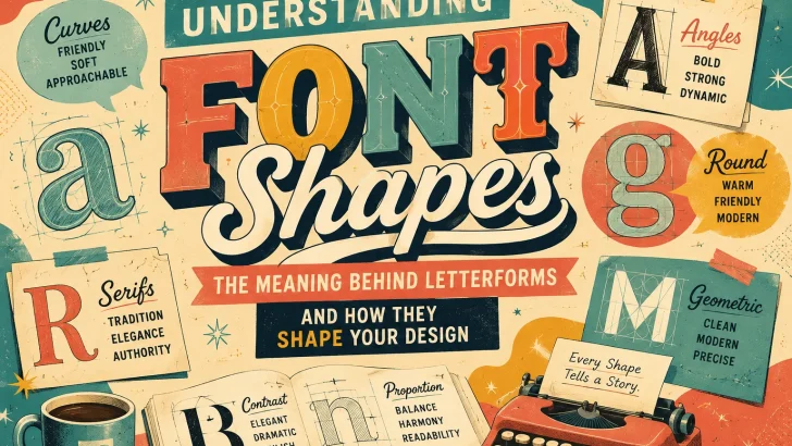
Discover the meaning behind font shapes and letterforms. Learn how curves, angles, serifs, terminals, and proportions influence typography, branding, and design.
Typography is more than choosing a beautiful typeface. Every letter has a visual personality, and subtle details such as curves, angles, serifs, terminals, proportions, and spacing can change the way a typeface feels.
A rounded font may appear friendly and approachable. A sharp, angular typeface can feel energetic, technical, or aggressive. A traditional serif can communicate heritage and sophistication, while a geometric sans serif may suggest simplicity and modernity.
These impressions are not universal rules—context, culture, size, color, and surrounding design all matter. However, understanding the visual language of font shapes can help designers make more intentional typography decisions.
In this guide, we’ll explore the meaning behind different letterform shapes and how they can be used in branding, logos, packaging, posters, social media graphics, and other creative projects.
What Is Letterform Shape?
A letterform is the visual form or structure of an individual character. In typography, designers carefully construct every part of a letter, from its curves and strokes to its proportions and terminals.
Consider the difference between these two approaches:
Rounded + soft + wide
and
Sharp + narrow + angular
Even without reading the words, the two styles can create very different emotional impressions.
This is why font personality matters.
When selecting a typeface, designers are not simply choosing letters. They are choosing a visual voice for their message.
1. Rounded Shapes: Friendly, Soft & Approachable
Rounded letterforms are commonly associated with softness, friendliness, playfulness, and accessibility.
Fonts with circular counters, smooth curves, and rounded terminals can feel less formal than fonts dominated by sharp angles.
Rounded fonts work well for:
- Children’s brands
- Food and beverage packaging
- Lifestyle brands
- Casual businesses
- Social media graphics
- Gaming projects
- Friendly technology brands
Rounded typography can also make a brand appear more approachable.
For example, a children’s product may benefit from soft, rounded letterforms because the shapes visually reinforce a playful personality.
Design Tip
Rounded fonts can become difficult to read when every element is extremely soft or decorative. Pair a playful display font with a simpler typeface for supporting information.
2. Sharp & Angular Shapes: Energy, Strength & Drama
Sharp angles create a completely different impression.
Angular letterforms can communicate:
- Energy
- Strength
- Speed
- Tension
- Aggression
- Technology
- Modernity
This makes angular display fonts particularly effective for posters, sports branding, gaming graphics, music artwork, and action-oriented campaigns.
Sharp typography can also create a sense of danger or mystery, which explains why angular forms frequently appear in horror, metal, extreme sports, and fantasy design.
Design Tip
Angular display fonts are powerful at large sizes, but their unusual shapes can reduce readability in long paragraphs.
Use them where visual impact matters more than extended reading.
3. Circular & Geometric Forms: Modern, Clean & Precise
Geometric typefaces often use basic shapes such as circles, rectangles, and straight lines as part of their construction.
Think about the visual character of:
- Circular “O” shapes
- Geometric “G” shapes
- Straight-sided “M” forms
- Simple “E” structures
- Consistent stroke widths
These characteristics can create an impression of order, precision, simplicity, and modernity.
Geometric fonts are often suitable for:
- Technology brands
- Startups
- Architecture
- Modern fashion
- Editorial design
- UI design
- Corporate identities
However, geometric doesn’t automatically mean “better” or “more professional.” The right choice depends on the brand and context.
4. Organic Curves: Human, Natural & Expressive
Not every curve feels geometric.
Organic letterforms often contain irregular curves, flowing strokes, handmade details, or subtle variations.
These characteristics can make a typeface feel:
Human rather than mechanical.
Organic fonts are particularly useful when a designer wants to communicate authenticity, creativity, craftsmanship, or individuality.
They work beautifully for:
- Handmade brands
- Artisan products
- Coffee packaging
- Boutique businesses
- Beauty products
- Creative portfolios
- Food brands
- Lifestyle products
This is one reason handcrafted display fonts continue to be popular in packaging and branding.
5. Serifs: Heritage, Elegance & Authority
Serifs are the small finishing strokes found on many traditional typefaces.
Their shape and construction can vary dramatically, but serif typography is often associated with tradition, sophistication, editorial design, and authority.
Serif fonts can work particularly well for:
- Luxury brands
- Editorial publications
- Fashion
- Hospitality
- Historical themes
- Premium packaging
- Professional services
However, not all serif fonts feel traditional.
A high-contrast fashion serif can look completely different from a heavy slab serif.
This is an important lesson:
The category of a font doesn’t determine its personality by itself.
Weight, proportion, contrast, spacing, and individual letter shapes all contribute to the final impression.
6. Sans Serif Shapes: Simple, Modern & Versatile
Sans serif typefaces remove the traditional serif details and often create a cleaner visual appearance.
They are widely used across:
- Websites
- Apps
- Corporate identities
- Packaging
- Advertising
- Social media
- Editorial design
Their personality can range from highly technical to playful and friendly.
A thin geometric sans serif may feel elegant and minimalist, while a heavy rounded sans serif may feel energetic and youthful.
Therefore, simply calling something a “sans serif font” doesn’t tell the whole story.
7. High Contrast: Elegant, Fashionable & Dramatic
Typography with strong contrast between thick and thin strokes can create a sophisticated visual rhythm.
High-contrast typefaces are frequently associated with:
- Fashion
- Luxury
- Beauty
- Editorial design
- High-end branding
- Invitations
The dramatic difference between thick and thin strokes gives the letters a distinctive visual presence.
Best Use
High-contrast fonts are especially effective for headlines, logos, magazine covers, and short statements.
For small body text, however, excessive contrast can sometimes affect readability depending on the design and output size.
8. Heavy & Bold Shapes: Confidence & Impact
Heavy typefaces occupy more visual space and immediately attract attention.
Bold letterforms can communicate:
- Confidence
- Power
- Importance
- Energy
- Youthfulness
- Strength
This makes them excellent choices for:
- Posters
- Headlines
- Advertising
- Sports graphics
- Packaging
- YouTube thumbnails
- Social media campaigns
A bold font can make even a short word feel visually substantial.
Design Tip
If your headline font is extremely heavy, consider using a lighter and simpler companion font for descriptions.
Contrast creates hierarchy.
9. Thin Letterforms: Elegant, Minimal & Delicate
Thin fonts create a lighter visual footprint.
They can feel:
- Elegant
- Refined
- Minimal
- Delicate
- Contemporary
- Sophisticated
Thin typography is popular in fashion, beauty, architecture, luxury branding, and editorial design.
However, thin fonts need sufficient contrast and adequate size to remain readable.
A typeface that looks beautiful on a large monitor may become difficult to read when printed very small.
10. Wide Letterforms: Open, Bold & Spacious
Wide or expanded typefaces occupy more horizontal space.
Their proportions can create a feeling of openness and confidence.
Wide fonts can be particularly effective for:
- Posters
- Headlines
- Branding
- Editorial covers
- Display typography
- Large packaging
They can also create a strong retro or cinematic feeling depending on their construction.
11. Narrow & Condensed Fonts: Efficient & Dramatic
Condensed typefaces compress letters horizontally, allowing designers to fit large words into limited spaces.
They are frequently used in:
- Posters
- Headlines
- Newspaper-style layouts
- Sports graphics
- Packaging
- Event branding
- Editorial design
Condensed typography can feel powerful because it allows a large amount of text to occupy relatively little horizontal space.
It can also create a sense of urgency or visual tension.
12. Soft Terminals: Friendly & Contemporary
A terminal is the ending of a stroke that doesn’t form a serif.
The way a terminal ends can significantly change the character of a font.
Soft, rounded terminals can make typography appear:
- Friendly
- Casual
- Modern
- Playful
- Accessible
This small detail is one of the reasons two sans serif fonts can feel completely different even when they share similar proportions.
13. Sharp Terminals: Precision & Sophistication
Sharp terminals create a more precise and defined appearance.
They can contribute to a feeling of:
- Elegance
- Precision
- Seriousness
- Technical sophistication
- Drama
This characteristic is particularly interesting in display typography because small structural details become much more visible at large sizes.
14. Irregular Letterforms: Handmade & Authentic
Perfectly consistent typography can feel polished and professional.
But sometimes designers want the opposite.
Irregular letterforms introduce controlled imperfections such as:
- Uneven baselines
- Slightly different stroke widths
- Hand-drawn curves
- Irregular spacing
- Unique character shapes
These details can create an authentic handmade feeling.
This is especially valuable for brands that want to communicate craftsmanship rather than mass production.
15. Decorative Shapes: Personality Over Readability
Decorative typefaces push letterform design much further.
Characters may include:
- Illustrative elements
- Unusual terminals
- Swashes
- Symbols
- Texture
- Distortion
- Decorative flourishes
These fonts can create an instant theme.
For example:
A spooky display font can immediately suggest Halloween or horror.
A retro font can evoke a particular era.
A western-inspired font can establish a specific visual atmosphere.
Decorative fonts are therefore excellent for creating a strong first impression.
But there’s an important rule:
The more decorative the font, the more carefully you should consider readability.
Font Shape & Brand Personality
The most interesting part of typography is how individual characteristics work together.
Imagine a brand with:
- Rounded letters
- Heavy weight
- Wide proportions
- Soft terminals
- Bright colors
The overall result might feel playful and energetic.
Now imagine:
- High contrast
- Sharp serifs
- Thin strokes
- Narrow proportions
- Generous spacing
The result could feel elegant, sophisticated, and editorial.
Neither combination is inherently better.
They simply communicate different visual personalities.
How to Choose Font Shapes for Your Project
Before selecting a typeface, ask five questions:
1. Who is the audience?
A children’s product and a luxury fashion brand probably shouldn’t use the same typography.
2. What emotion should the design create?
Should it feel:
- Fun?
- Elegant?
- Powerful?
- Mysterious?
- Friendly?
- Traditional?
- Modern?
3. Where will the font be used?
A logo, website, packaging label, poster, and paragraph all have different requirements.
4. How much text will be displayed?
A highly decorative font may work perfectly for a two-word headline but fail when used for a long paragraph.
5. Does the font match the brand?
A beautiful typeface can still be the wrong choice if its personality conflicts with the brand.
Don’t Choose a Font by Category Alone
One of the biggest typography mistakes is choosing fonts only by category.
For example:
“I need a serif font.”
That’s only the beginning.
There are elegant serifs, vintage serifs, modern serifs, editorial serifs, western serifs, playful serifs, dramatic serifs, and many other variations.
The same applies to sans serif, script, display, handwritten, and decorative typefaces.
Instead of asking:
“What type of font should I use?”
Try asking:
“What visual personality should my typography communicate?”
This question usually leads to better design decisions.
The Power of Combining Different Font Shapes
Font pairing is another opportunity to use shape contrast.
For example:
Serif + Sans Serif
Classic + modern
Bold + Light
Strong + elegant
Rounded + Geometric
Friendly + structured
Display + Neutral Sans
Expressive + readable
Script + Serif
Personal + sophisticated
The key is not simply choosing two attractive fonts.
The goal is to create contrast without visual conflict.
Final Thoughts
Every typeface tells a visual story.
Curves can feel soft. Angles can feel energetic. Serifs can suggest tradition. Geometric structures can communicate precision. Irregular shapes can create authenticity. Heavy weights can demand attention, while thin strokes can create elegance.
But typography isn’t a fixed psychological formula.
Context matters.
Color, layout, spacing, imagery, scale, language, culture, and brand positioning all influence how a typeface is perceived.
Understanding font shapes simply gives designers another tool for making better decisions.
The next time you choose a typeface, don’t just ask whether you like the font.
Look closer.
Study the curves.
Examine the terminals.
Compare the proportions.
Look at the stroke contrast.
Notice the spacing.
Think about the overall personality.
Because sometimes, the smallest shape in a letter can make the biggest difference in a design.
Ready to Find Your Next Typeface?
Explore a curated collection of display, serif, sans serif, handwritten, script, retro, and decorative fonts designed to give your next project a distinctive visual personality.
Choose the shape. Define the mood. Make your typography memorable.