Artico Clover: A Bold Retro Brush Font Inspired by Traditional Sign Painting
Typography has the power to give a design its own personality. While clean and minimalist fonts are perfect for modern layouts, bold hand-painted lettering brings something different to the table: character, energy, and a sense of nostalgia.
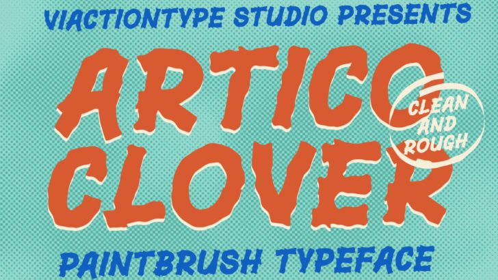
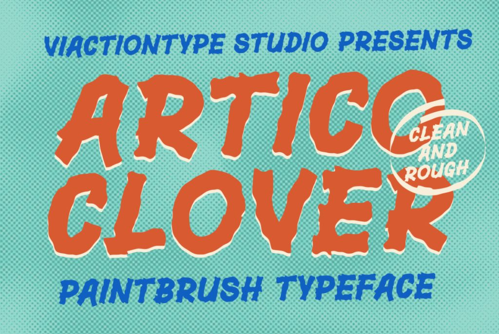
Introducing Artico Clover, a bold retro brush font inspired by traditional sign painters who create expressive lettering using paintbrushes on paper, walls, and other surfaces. With its thick strokes, irregular letterforms, and solid shapes, Artico Clover captures the distinctive appearance of handmade lettering while making it easy to use in modern digital design.
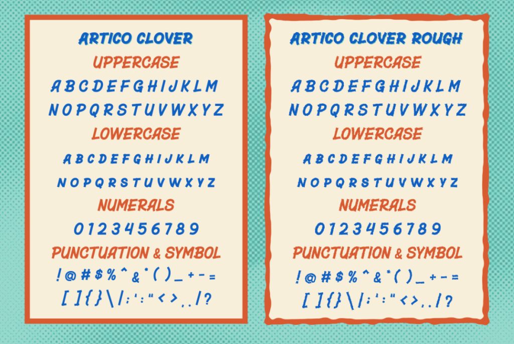
Available in two styles, Regular and Rough, this retro brush font is designed for creatives who want to combine vintage aesthetics with a strong, handcrafted visual identity.
What Is a Retro Brush Font?
A retro brush font is a typeface inspired by lettering created with brushes, often associated with vintage advertising, hand-painted signs, classic packaging, and old-school promotional graphics.
Unlike delicate brush script fonts that imitate flowing handwriting, bold retro brush fonts focus on strong letterforms, solid strokes, and expressive shapes. Their appearance often includes irregular edges and subtle imperfections that make the lettering feel more natural and handmade.
These characteristics give retro brush typography a distinctive visual presence. It can make a headline feel energetic, a logo feel memorable, and a product label feel more authentic.
Artico Clover embraces this aesthetic through its bold, solid letterforms and organic contours inspired by traditional sign painting.
Inspired by Traditional Sign Painters
Before digital typography became widely accessible, sign painters created lettering by hand for storefronts, advertisements, restaurant signs, posters, and commercial displays.
Using brushes and paint, they developed letterforms that were practical, readable, and visually distinctive. The natural movement of the brush often produced slight variations in shape and edge, giving each piece of lettering its own character.
This tradition is the foundation of Artico Clover.
Rather than relying on perfectly geometric forms, Artico Clover features irregular letter shapes and organic edges that evoke the appearance of manually painted lettering. Its strokes feel firm and substantial, creating a bold visual impression without losing the charm of handmade typography.
The result is a typeface that connects the nostalgic appeal of vintage sign painting with the flexibility of a digital font.
Meet Artico Clover: Two Distinctive Styles
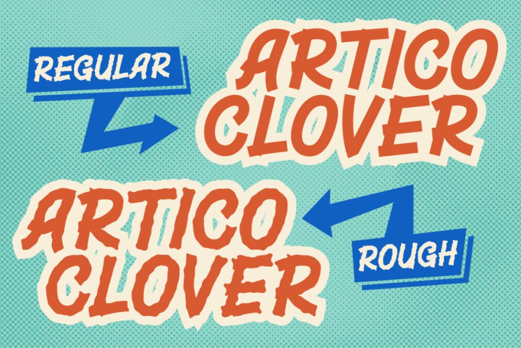
Artico Clover comes in two complementary styles: Regular and Rough. Each style offers a different way to bring bold brush lettering into your creative projects.
1. Artico Clover Regular
The Regular style delivers bold, solid lettering with naturally irregular contours. It captures the character of hand-painted typography while maintaining a strong and consistent visual presence.
Use Artico Clover Regular when you want your typography to stand out without relying on heavy distressing or additional textures.
It works especially well for retro logos, bold headlines, packaging, restaurant branding, promotional graphics, and vintage-inspired posters.
2. Artico Clover Rough
For designs that need a more weathered and textured appearance, Artico Clover Rough introduces a rougher interpretation of the same retro brush aesthetic.
Its distressed character adds visual texture and reinforces the impression of handmade lettering. This makes it a suitable choice for vintage-inspired artwork, streetwear graphics, retro advertisements, and designs that benefit from a more rugged personality.
Pair it with textured backgrounds, limited color palettes, or vintage illustrations to create a cohesive retro composition.
Together, Regular and Rough give designers two complementary approaches to bold, hand-painted typography.
Why Choose Bold Hand-Painted Typography?
In a crowded visual environment, typography needs to do more than communicate words. It also needs to establish mood and personality.
Bold hand-painted lettering offers several advantages for creative projects.
It creates a strong visual impact. Thick strokes and substantial letterforms make headlines more prominent, helping important messages attract attention.
It adds a handmade character. Organic shapes and irregular contours introduce a human quality that differs from highly geometric digital typefaces.
It communicates a vintage aesthetic. Brush-inspired lettering naturally complements retro graphics, traditional signage, and nostalgic branding.
It creates memorable branding. A distinctive display font can help a brand develop a recognizable visual identity across packaging, promotional materials, and digital platforms.
Artico Clover brings these qualities together in a typeface designed to make bold typography a central part of your design.
Best Uses for Artico Clover Retro Brush Font
Because of its strong shapes and expressive character, Artico Clover is particularly effective in projects where typography plays an important visual role.
Logo Design and Retro Branding
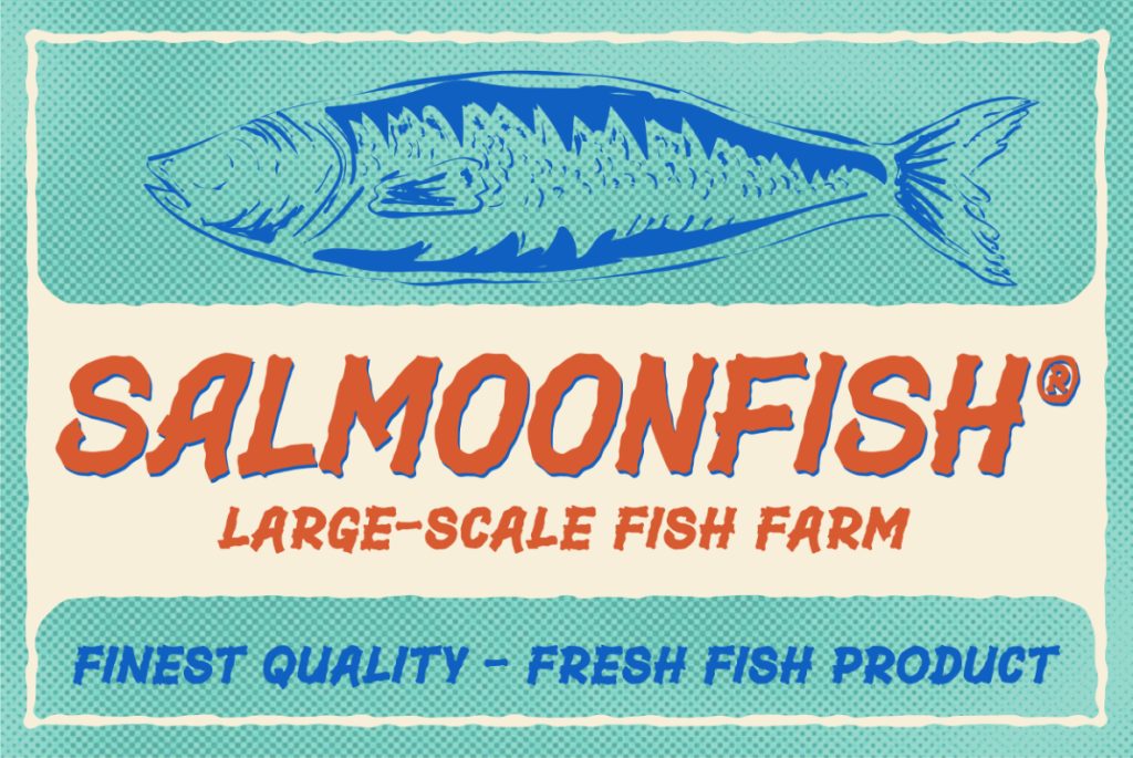
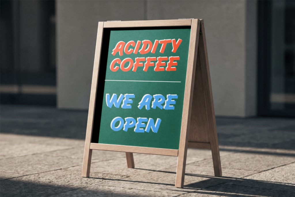
Create a memorable visual identity for independent brands, cafés, restaurants, creative studios, and businesses inspired by vintage aesthetics.
Artico Clover’s bold letterforms can help establish a distinctive brand personality, especially when paired with complementary illustrations or simple graphic elements.
Vintage Posters and Advertising
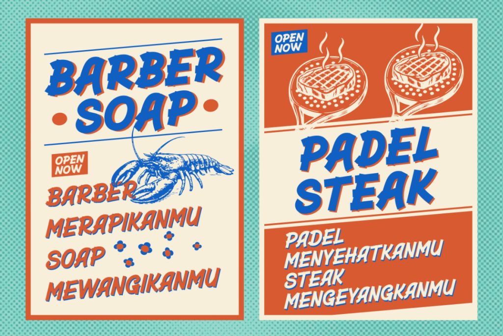
Retro brush typography is a natural choice for promotional posters, event graphics, product announcements, and advertising campaigns.
Use Artico Clover for the main headline to establish a clear focal point. Combine it with a cleaner sans serif font for supporting information to maintain readability and visual balance.
Product Packaging and Labels
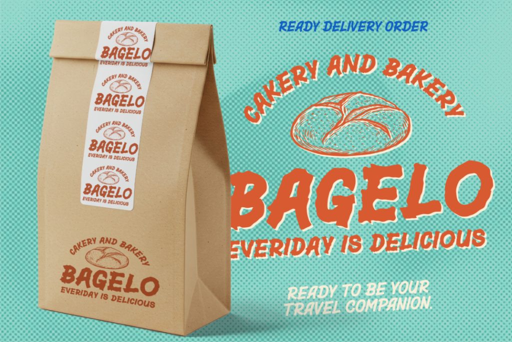
Packaging often needs to communicate personality quickly. A bold display font can help products stand out while reinforcing a particular brand aesthetic.
Artico Clover is suitable for packaging concepts inspired by traditional craftsmanship, nostalgic food branding, specialty products, and vintage-inspired retail design.
Restaurant and Café Branding
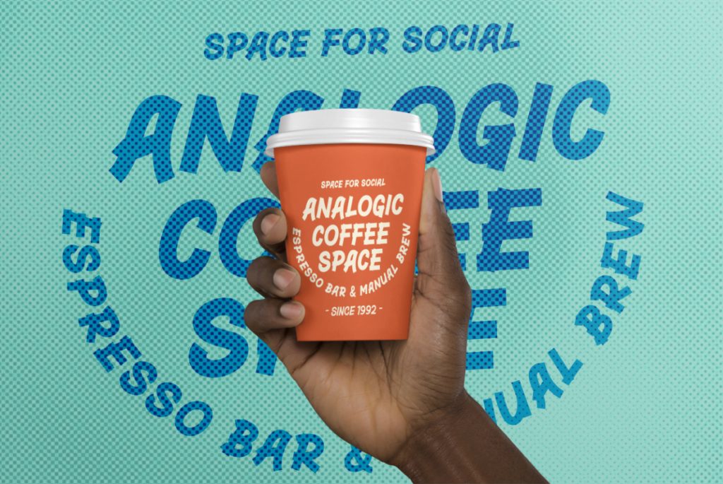
Hand-painted lettering has a long-standing connection with restaurant signs, menus, storefront graphics, and food-related branding.
Artico Clover can help create a bold, welcoming identity for cafés, diners, bakeries, food trucks, and other businesses looking for a retro visual style.
Apparel and Merchandise Graphics
The strong shapes of Artico Clover make it useful for T-shirt graphics, tote bags, stickers, badges, and other merchandise designs.
The Regular style offers a solid lettering appearance, while Rough provides a more weathered aesthetic for graphics that call for extra texture and character.
Social Media and Digital Graphics
Artico Clover can also bring personality to Instagram posts, promotional banners, YouTube thumbnails, digital advertisements, and other visual content.
Use short, impactful phrases and give the lettering enough space to stand out. Its bold shapes work particularly well when the typography is treated as a major graphic element.
How to Get the Best Results with Artico Clover
Choosing a distinctive font is only the beginning. The way you use it can make a significant difference to the final design.
Here are a few practical tips for working with Artico Clover.
1. Use it for headlines and short phrases.
Artico Clover is a display font, so its strongest application is in prominent text rather than long paragraphs. Short phrases allow its letterforms to become part of the visual composition.
2. Combine it with a clean supporting font.
Pair Artico Clover with a simple sans serif typeface for body text, product details, or secondary information. This contrast helps maintain readability while allowing the brush lettering to remain the focal point.
3. Experiment with bold color combinations.
Vintage-inspired palettes, contrasting colors, and limited color schemes can complement the font’s retro personality. Choose colors according to the mood and audience of your project.
4. Explore different background textures.
For a cleaner result, place Regular against a plain background. For a more weathered vintage appearance, experiment with Rough alongside subtle grain, paper textures, or distressed graphic elements.
5. Keep the composition balanced.
Because Artico Clover has substantial letterforms, avoid crowding the design with too many competing elements. Give the headline room to breathe and use supporting graphics purposefully.
Bring Retro Sign Painting into Your Next Design
Artico Clover celebrates the bold personality of traditional sign painting through a digital typeface made for contemporary creative work.
Its thick, solid strokes, irregular letterforms, and organic edges bring the charm of hand-painted lettering to logos, posters, packaging, branding, merchandise, and digital graphics.
With Regular and Rough styles, you can choose between a bold, solid appearance and a more distressed interpretation of the same retro aesthetic.
If you’re looking for a retro brush font that feels expressive, handcrafted, and visually confident, Artico Clover offers a distinctive way to make your typography stand out.
Artico Clover — Bold strokes. Handmade character. Timeless retro style.
Discover Artico Clover and bring the spirit of traditional sign painting into your next creative project.