Learn the key differences between OTF and TTF font formats. Discover which font type is better for design, performance, and compatibility.
Introduction
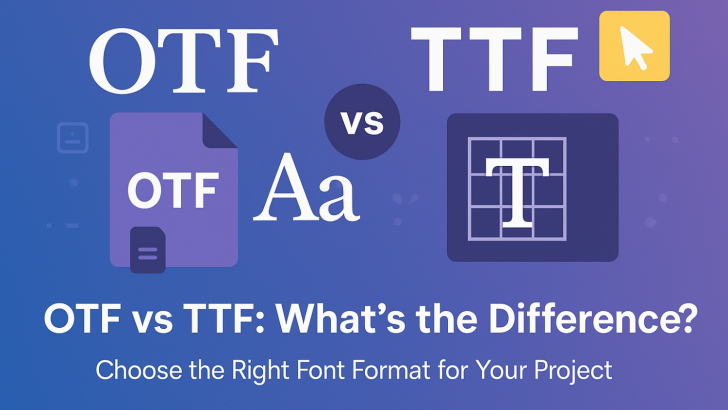
When working with digital fonts, especially in design or development, you’ll often come across two popular file formats: OTF (OpenType Font) and TTF (TrueType Font). While they may look similar at first glance, each has its own advantages depending on your use case. In this article, we’ll break down the differences between OTF and TTF, their pros and cons, and help you decide which font format is best for you.
What is TTF (TrueType Font)?
TrueType was developed by Apple in the late 1980s and later adopted by Microsoft. It became the most widely used font format for many years due to its simplicity and widespread compatibility.
Key Features of TTF:
-
Uses quadratic Bézier curves for rendering.
-
Supported by all major operating systems (Windows, macOS, Linux).
-
Good for screen readability.
-
Simple file structure makes it easier for OS-level font rendering.
What is OTF (OpenType Font)?
OpenType was developed jointly by Microsoft and Adobe as an evolution of TrueType. It combines the structure of TTF with additional features, making it more versatile, especially for advanced typography.
Key Features of OTF:
-
Uses cubic Bézier curves (from PostScript) for more complex shapes.
-
Supports advanced typographic features like ligatures, alternate characters, and glyph substitutions.
-
Better suited for professional publishing and high-end design projects.
-
More compact and flexible due to cross-platform support.
OTF vs TTF: Head-to-Head Comparison
| Feature | TTF (TrueType) | OTF (OpenType) |
|---|---|---|
| – Release Date | – 1980s | – 1990s |
| – Curve Type | – Quadratic Bézier | – Cubic Bézier |
| – Advanced TypographicFeatures | – Limited | – Extensive |
| File Size | – Slightly larger | – More compact |
| – Compatibility | – Universal | – Universal |
| – Ideal Use | – On-screen reading, web design | – Print, high-end typography |
When to Use TTF
-
If you’re working on web development and need maximum compatibility across platforms.
-
If the font doesn’t need advanced typographic features.
-
When you prioritize simplicity and faster rendering on older systems.
When to Use OTF
-
If you’re working on branding, publishing, or editorial design that requires stylistic alternates, ligatures, or glyph support.
-
If you want better typographic control for high-end or professional work.
-
For cross-platform projects where consistent rendering is crucial.
Is One Better Than the Other?
Not necessarily. Each format serves a different purpose. For everyday use and digital interfaces, TTF is perfectly adequate. For advanced typography and creative flexibility, OTF is the better choice.
Conclusion
Choosing between OTF and TTF depends on your specific needs. If you’re a designer needing rich typographic options, go with OTF. If you’re a developer or casual user focused on compatibility, TTF will do the job. Understanding the strengths of each format will help you make smarter font choices for any project.