
Typography plays a critical role in shaping a brand’s identity. The right typeface can communicate professionalism, creativity, or reliability, while poor typography choices can confuse your audience or even damage your brand’s reputation. Let’s explore some common typography mistakes in branding and how you can avoid them to create a strong and cohesive identity.
1. Using Too Many Fonts
One of the most common mistakes is using too many fonts in a single design. While it might seem creative to mix and match different typefaces, it often results in a cluttered and unprofessional look.
How to avoid it: Stick to a maximum of two to three complementary fonts. Use one font for headings, another for body text, and an optional third for accents or special highlights.
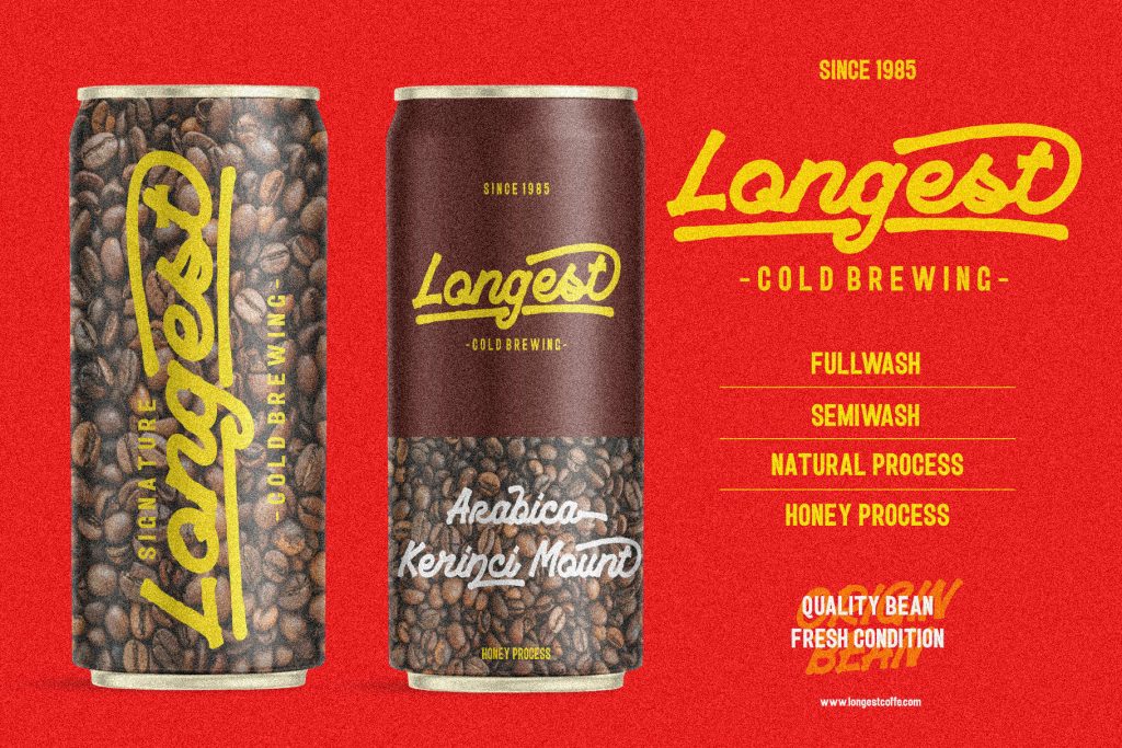
Example of a Brand that uses two fonts. The Brand logo uses the Playride font.
2. Ignoring Readability
Choosing an overly decorative or complex font can hinder readability, especially in smaller sizes. This can make your content difficult to understand, frustrating your audience.
How to avoid it: Prioritize legibility when selecting fonts. Test your typography on different screen sizes and formats to ensure it’s easy to read.
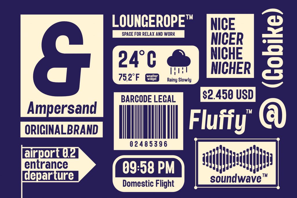
Examples of font usage in various sizes & purposes. Fonts using Yanice Sans Serif
3. Inconsistent Typography Across Platforms
A lack of consistency in typography can weaken your brand’s visual identity. For instance, using different fonts or sizes on your website, social media, and print materials can confuse your audience.
How to avoid it: Create a typography guide as part of your brand guidelines. Define specific fonts, sizes, and spacing for different use cases to ensure consistency across all platforms.
4. Poor Hierarchy
Without a clear hierarchy, your content can appear chaotic and make it difficult for readers to focus on key messages.
How to avoid it: Use font size, weight, and style to establish a clear hierarchy. For example, headings should be larger and bolder than body text, and subheadings should be distinct yet complementary.
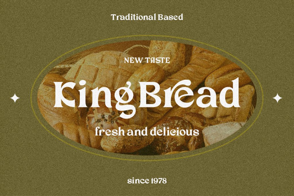
A good example of hierarchy implementation and the message is conveyed clearly. The product uses the Chiffone font.
5. Choosing Trends Over Brand Identity
While it’s tempting to follow typography trends, not all of them align with your brand’s personality. For example, a playful handwritten font might not suit a corporate law firm.
How to avoid it: Focus on selecting fonts that align with your brand’s values and target audience. Trends should only be adopted if they enhance your brand’s message.
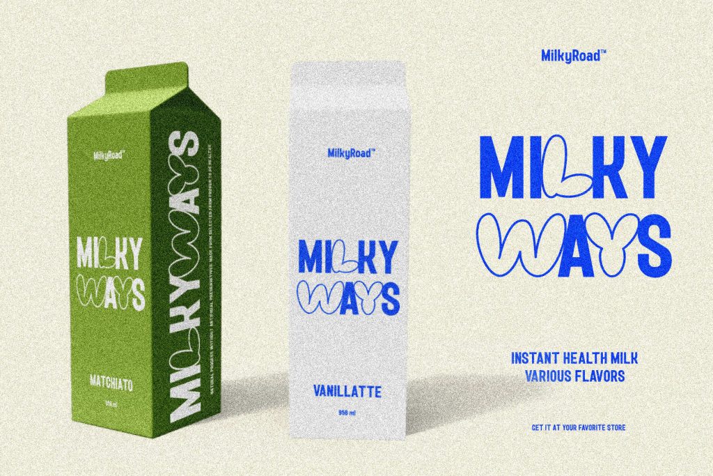
An example of the use of a trending font and applied to a milk brand for young people.
The font on the packaging uses the Milky Road font.
6. Neglecting Line Spacing and Alignment
Improper line spacing (leading) or poor alignment can make your text look unpolished and hard to read.
How to avoid it: Ensure adequate spacing between lines and align your text consistently. A good rule of thumb is to set the line height to 120-150% of the font size.
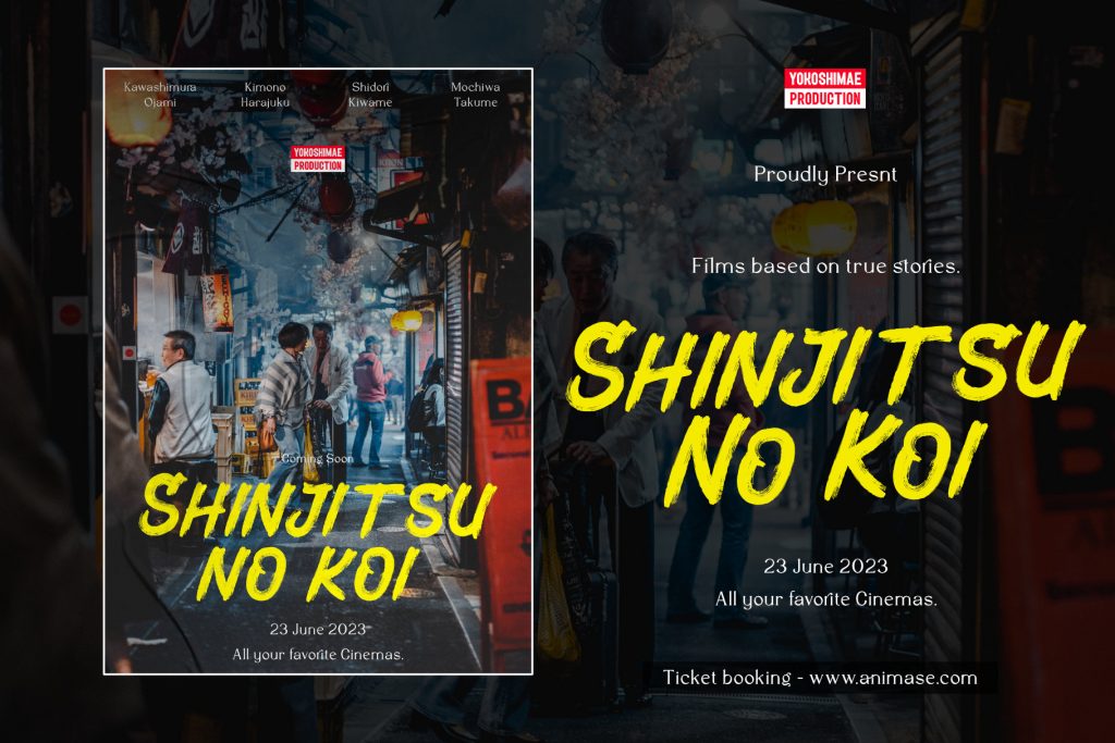
Example of choosing a font with a nice leading, for the needs of a cinema film title.
The film title uses the Lanecar Headline font.
7. Overlooking Contrast
Using colors that don’t provide enough contrast between text and background can make your typography illegible.
How to avoid it: Use color contrast checkers to ensure your text is easily readable, even for people with visual impairments. Light text on dark backgrounds or vice versa often works well.
8. Failing to Optimize for Digital Use
Some fonts look great in print but don’t translate well to digital screens. Thin or overly detailed fonts can become pixelated or blurry online.
How to avoid it: Choose web-friendly fonts and test them on various devices to ensure clarity. Consider using scalable vector formats for digital applications.

Example of font usage on Brand Name and product name on a website and still clearly readable.
Font using Kupertino Grotesk.
9. Ignoring Cultural and Contextual Nuances
Certain fonts may carry cultural or contextual connotations that could misrepresent your brand. For example, using a Gothic font for a children’s brand might send the wrong message.
How to avoid it: Research your audience and their cultural preferences to select fonts that resonate positively with them.

An example of using the Blackletter font on a classic rock band album that fits the character of the band.
The Blackletter font uses the Datons font.
10. Forgetting Accessibility
Typography that doesn’t account for accessibility can exclude a significant portion of your audience. Small text sizes, poor contrast, and overly stylized fonts are common culprits.
How to avoid it: Follow accessibility guidelines, such as using larger font sizes, high contrast, and readable typefaces. Tools like WCAG compliance checkers can help ensure your typography is inclusive.
Conclusion
Typography is more than just selecting a font; it’s a powerful tool for communicating your brand’s personality and values. By avoiding these common mistakes, you can create a cohesive and professional visual identity that resonates with your audience. Take the time to refine your typography choices, and you’ll build a brand that’s not only visually appealing but also memorable