Discover why Helvetica dominates global design with its clean aesthetics, unmatched versatility, and timeless appeal. Dive into its history, design features, and modern applications.
Introduction
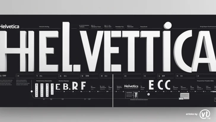
In a world of ever-changing design trends, one font has reigned supreme for over six decades: Helvetica. From subway signs to corporate logos, this Swiss-born typeface has become synonymous with clarity, neutrality, and modernity. But what makes Helvetica the undisputed king of fonts? Let’s explore its enduring legacy, design brilliance, and why it remains a go-to choice for designers worldwide.
A Brief History of Helvetica
Helvetica was born in 1957 in Switzerland, crafted by typeface designer Max Miedinger and Eduard Hoffmann of the Haas Type Foundry. Originally named Neue Haas Grotesk, it was rebranded as Helvetica (derived from Helvetia, Latin for Switzerland) to appeal to international markets. Its creation coincided with the rise of the Swiss Design Movement, which emphasized minimalism, readability, and functionality—values that Helvetica embodies perfectly.
By the 1960s, Helvetica exploded in popularity, becoming a staple for corporate branding, transportation systems, and government communications. Its simplicity made it a favorite for companies like BMW, American Apparel, and Panasonic, while institutions like the New York City Subway adopted it for its legibility.
Design Features That Define Helvetica
Helvetica’s dominance isn’t accidental—it’s rooted in meticulous design principles:
- Neutrality: Its lack of decorative flourishes allows it to adapt to any context without overshadowing content.
- Clean Geometry: Balanced proportions, uniform stroke widths, and tight kerning create visual harmony.
- Legibility: High x-height and open counters ensure readability at any size, from billboards to smartphone screens.
- Versatile Character Set: Distinctive glyphs, like the squared-off tail of the uppercase R or the curved lowercase a, add subtle personality while maintaining neutrality.
Unlike flashy display fonts, Helvetica’s strength lies in its ability to communicate without distraction. As designer Massimo Vignelli famously said, “Helvetica is the jeans of the typeface world.”
Why Helvetica’s Versatility is Unmatched
Helvetica’s true power is its adaptability across industries and mediums:
- Branding: Brands like Toyota, Target, and Microsoft have used Helvetica to convey trust and modernity.
- Public Spaces: The NYC Subway, U.S. government documents, and EU signage rely on its clarity.
- Digital Design: Tech giants like Apple (pre-San Francisco) integrated Helvetica into their interfaces for its screen-friendly readability.
- Print & Packaging: From magazine layouts (TIME, Vogue) to product labels, it ensures clean, professional aesthetics.
Its neutrality also makes it a perfect pairing font. Combine it with bold serifs for contrast or use it solo for a minimalist vibe—it always delivers.
Helvetica in Modern Design Trends
While some claim Helvetica is “overused,” its relevance persists in contemporary design:
- Flat Design: Its simplicity aligns with the “less is more” ethos of flat UI/UX design.
- Responsive Web Design: Performs flawlessly across devices, a critical factor in mobile-first strategies.
- Sustainability: Its timelessness reduces the need for frequent rebranding, aligning with eco-conscious practices.
Even in 2023, Helvetica remains a top choice for startups, agencies, and Fortune 500 companies alike.
Also read : Top 5 Fonts for Minimalist Website Layouts in 2025
Criticisms & Counterarguments
Detractors argue Helvetica is “bland” or “ubiquitous,” but its ubiquity is a testament to its effectiveness. While niche projects may opt for expressive typefaces, Helvetica’s strength is its universality—it works where others fail. As designer Paula Scher notes, “Helvetica is not a font; it’s a standard.”
Conclusion
Helvetica’s reign as the king of fonts is no accident. Its timeless design, unmatched versatility, and cultural resonance make it indispensable in a designer’s toolkit. Whether you’re crafting a logo, designing an app, or printing a poster, Helvetica guarantees clarity and professionalism. In a noisy world, sometimes the best choice is the one that speaks softly but carries a bold message.