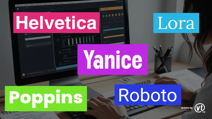
Discover the top 5 fonts for minimalist website layouts in 2025. Learn how to use Helvetica, Yanice, Lora, Roboto, and Poppins to create clean, user-friendly designs.
Minimalist website design continues to dominate the digital landscape in 2025, offering clean, clutter-free layouts that prioritize usability and aesthetics. A key element of minimalist design is typography—choosing the right font can make or break your website’s visual appeal. In this article, we’ll explore the top 5 fonts for minimalist website layouts in 2025, along with tips on how to use them effectively to create stunning, user-friendly designs.
Why Typography Matters in Minimalist Design
Minimalist design relies on simplicity, clarity, and functionality. Typography plays a crucial role in achieving these goals by:
- Enhancing Readability: Clean, legible fonts ensure users can easily consume your content.
- Creating Visual Hierarchy: Well-chosen fonts help guide users through your website’s layout.
- Conveying Brand Identity: Fonts contribute to the overall tone and personality of your brand.
- Maintaining Aesthetic Balance: Minimalist fonts complement the simplicity of the design without overwhelming it.
Top 5 Fonts for Minimalist Website Layouts in 2025
1. Helvetica
Why It Works:
Helvetica is a timeless sans-serif font known for its neutrality and versatility. Its clean, geometric shapes make it perfect for minimalist designs.
Best Use Cases:
- Corporate websites
- Portfolio sites
- E-commerce platforms
Pairing Suggestions:
- Combine with a serif font like Georgia for contrast.
- Use bold weights for headings and regular weights for body text.
2. Yanice
Why It Works:
Yanice is a modern, sans-serif font designed for readability on screens. Its balanced proportions and high legibility make it ideal for minimalist layouts.
Best Use Cases:
- Blogs and news websites
- SaaS platforms
- Mobile-friendly designs
Pairing Suggestions:
- Pair with a monospaced font like Roboto Mono for a tech-savvy look.
- Use medium weights for headings and light weights for body text.
3. Lora
Why It Works:
Lora is a serif font with a contemporary feel. Its elegant, slightly rounded shapes add a touch of sophistication to minimalist designs without being overly decorative.
Best Use Cases:
- Lifestyle blogs
- Creative portfolios
- Editorial websites
Pairing Suggestions:
- Combine with a sans-serif font like Open Sans for balance.
- Use italic styles for emphasis in body text.
Also read : Why Typography Matters in Web Design: Key Tips for Better UX
4. Roboto
Why It Works:
Roboto is a geometric sans-serif font with a mechanical skeleton and friendly curves. Its versatility and readability make it a popular choice for minimalist designs.
Best Use Cases:
- Tech websites
- Mobile app interfaces
- Startup landing pages
Pairing Suggestions:
- Pair with a condensed font like Roboto Condensed for a modern look.
- Use thin weights for headings and regular weights for body text.
5. Poppins
Why It Works:
Poppins is a geometric sans-serif font with a clean, modern aesthetic. Its uniform stroke widths and rounded edges make it visually appealing and highly legible.
Best Use Cases:
- Creative agency websites
- Fashion and lifestyle brands
- Minimalist portfolios
Pairing Suggestions:
- Combine with a serif font like Merriweather for contrast.
- Use bold weights for headings and medium weights for body text.
Tips for Using Fonts in Minimalist Website Layouts
- Stick to One or Two Fonts
- Using too many fonts can clutter your design. Stick to one or two complementary fonts for a cohesive look.
- Prioritize Readability
- Choose fonts that are easy to read, especially for body text. Avoid overly decorative or condensed fonts.
- Use White Space Effectively
- White space enhances the simplicity of your design and allows your typography to stand out.
- Experiment with Font Weights
- Use different weights (e.g., light, regular, bold) to create contrast and hierarchy without adding extra elements.
- Test on Multiple Devices
- Ensure your chosen fonts are legible and visually appealing on desktops, tablets, and mobile devices.
Real-World Examples of Minimalist Typography
- Apple
- Apple’s website uses San Francisco, a clean sans-serif font, to create a sleek and modern look.
- Medium
- Medium uses Charter, a serif font, for body text, paired with a sans-serif font for headings, ensuring readability and elegance.
- Dropbox
- Dropbox uses Sharp Sans, a geometric sans-serif font, to convey simplicity and innovation.
Conclusion
Choosing the right font is essential for creating a minimalist website layout that is both visually appealing and user-friendly. The top 5 fonts for 2025—Helvetica, Yanice, Lora, Roboto, and Poppins—offer a range of styles to suit different design needs while maintaining the simplicity and clarity that define minimalist design.