typography hierarchy

5 Common Typography Mistakes Designers Should Avoid

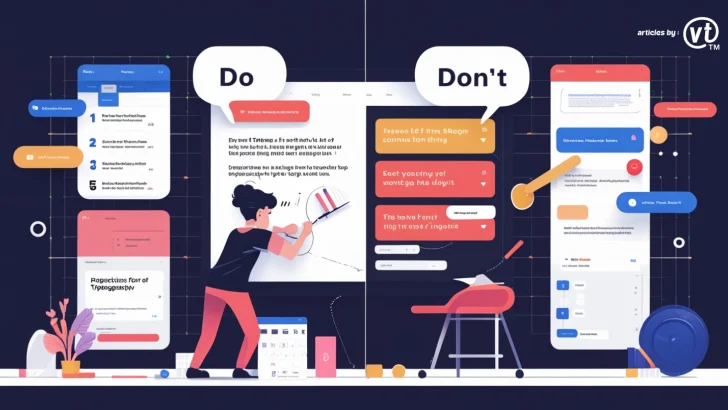
Avoid these five common typography mistakes to create better designs. Learn how to improve readability, hierarchy, and responsiveness for a professional look. Introduction Typography plays a crucial role in design, affecting readability, aesthetics, and user experience. However, even experienced designers can make mistakes that reduce the effectiveness of their work. In this article, we’ll discuss …

Continue reading →

Typography in Layout Design

Typography in Layout Design: Choosing the Right Fonts for Impact

Discover how typography influences layout design. Learn how to choose the right fonts, improve readability, and enhance visual impact in your designs. Introduction Typography is a fundamental element of design that plays a crucial role in shaping user experience and brand identity. The right font choices can enhance readability, create visual hierarchy, and convey the …

Continue reading →

The History of Typography: Lessons for Modern Designers

Typography has been a cornerstone of design for centuries, evolving from ancient scripts to digital typefaces that power today’s visual communication. For modern designers, understanding the history of typography isn’t just an academic exercise—it’s a way to draw inspiration, learn valuable lessons, and create designs that stand the test of time. In this article, we’ll …

Continue reading →

Common Typography Mistakes in Branding and How to Avoid Them

Typography plays a critical role in shaping a brand’s identity. The right typeface can communicate professionalism, creativity, or reliability, while poor typography choices can confuse your audience or even damage your brand’s reputation. Let’s explore some common typography mistakes in branding and how you can avoid them to create a strong and cohesive identity. 1. …

Continue reading →