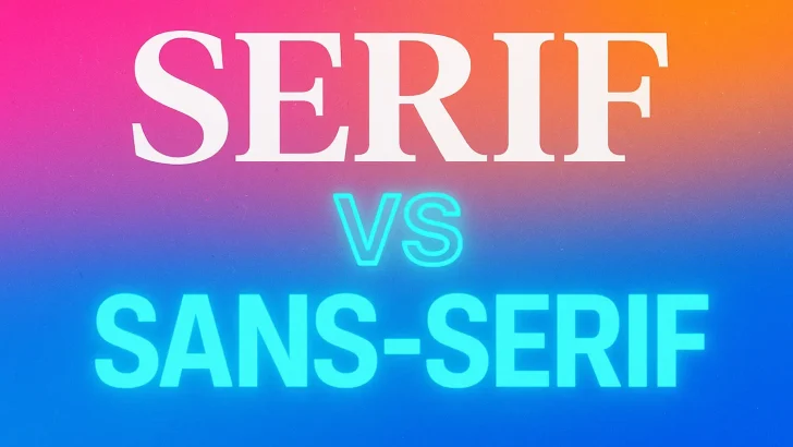
Serif vs sans-serif in 2025 — which font style performs best for digital design, branding, and user interfaces? Discover current trends and expert recommendations for modern typography.
For decades, designers have debated one of the most timeless questions in typography: Serif or Sans-Serif — which is better? In 2025, the conversation is more relevant than ever as typography continues to evolve with shifts in branding, UI/UX design, and AI-assisted workflows.
So which one is dominating today’s digital landscape?
Let’s break it down with a real-world look at trends, usability, and market demand.
A Quick Refresher: What’s the Difference?
| Typeface Style. | Key Visual Traits | Typical Use Cases |
|---|---|---|
| Serif | Letters feature decorative strokes or “feet” at the ends. | Editorial, luxury brands, formal documents |
| Sans-Serif | Clean and straight strokes without decorative endings | Web interfaces, apps, modern branding |
Trend Analysis: What Designers Prefer in 2025
✅ Digital Platforms Still Favor Sans-Serif
With mobile-first design dominating UI and accessibility standards, sans-serif fonts remain unbeatable for:
-
Readability on screens
-
Minimalist layouts
-
Scalable type systems for apps and dashboards
Fonts like Inter, Poppins, Helvetica Now, and SF Pro continue to rule the tech world.
✅ Serif Fonts Are Making a Comeback — But Strategically
Interestingly, serif typefaces are experiencing a revival in branding and editorial content, especially among:
-
Luxury & heritage brands
-
Personal blogs & newsletters
-
Wellness, fashion, and artisanal markets
Modern serifs like Playfair Display, Canela, and Spectral strike a balance between elegance and readability — making them ideal for “premium with personality” aesthetics.
The Hybrid Takeover: Enter Modern Serif + Sans Pairing
The real winner of 2025 isn’t serif or sans — it’s combination typography.
Brands like Airbnb, Vogue, Notion, and Spotify mix serif headlines with sans-serif body text to create contrast, hierarchy, and emotion.
Bold serif for storytelling. Clean sans-serif for clarity. Best of both worlds.
Which Is Better for Designers & Font Sellers Right Now?
| Scenario | Recommended Style |
|---|---|
| App / SaaS UI Kits | Sans-Serif (clean, geometric, high readability) |
| Luxury / Craft / Editorial Branding. | Serif or Transitional Serif |
| Youth / Pop Culture Design | Rounded Sans Serif или Grotesque fonts |
| AI or Tech Branding | Futuristic Sans Serif or Neo Grotesque |
| Pairing for Contrast | Serif headings + Sans-Serif body text |
Final Verdict: Not a Battle — A Balance
In 2025, it’s no longer a fight between serif and sans-serif. Both have their roles — and the smartest designers know when to use each.
-
Sans-serif wins for clarity and usability.
-
Serif wins for personality and storytelling.
-
Combining both creates timeless, high-impact design.
Typography isn’t about choosing sides — it’s about choosing strategy.