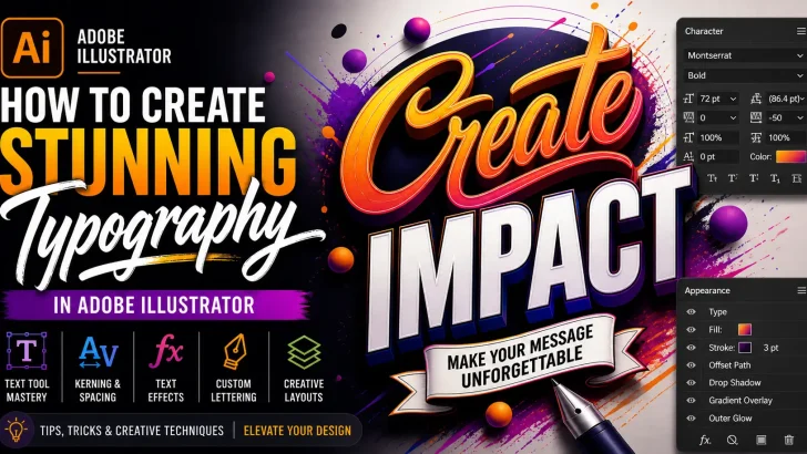
Learn how to create stunning typography in Adobe Illustrator using advanced text effects, creative techniques, and professional design tips to elevate your visual projects.
Typography is more than just choosing a font—it’s about crafting visual communication that captures attention and conveys emotion. With Adobe Illustrator, designers have powerful tools to transform simple text into stunning visual masterpieces.
Whether you’re creating branding, posters, or social media graphics, mastering typography in Illustrator can significantly elevate your design quality.
Why Typography Matters in Design
Strong typography can:
- Instantly grab attention
- Communicate brand personality
- Improve readability and user experience
- Create visual hierarchy
- Enhance overall aesthetics
In competitive digital spaces, typography often determines whether your design stands out—or gets ignored.
Essential Tools for Typography in Illustrator
Before diving into techniques, get familiar with these tools:
- Type Tool (T) – Create and edit text
- Character Panel – Adjust font, spacing, kerning, and leading
- Paragraph Panel – Control alignment and layout
- Appearance Panel – Add multiple effects to text
- Pen Tool – Customize letterforms manually
Step-by-Step: Creating Stunning Typography
Step 1: Choose the Right Font
Start with a font that matches your concept.
Tips:
- Use bold fonts for strong impact
- Script fonts for elegance
- Sans-serif for modern designs
Avoid overusing too many fonts—stick to 2–3 max.
Step 2: Adjust Kerning and Tracking
Fine-tune spacing between letters to improve balance and readability.
- Kerning: Space between individual letters
- Tracking: Overall spacing
Good spacing can make even a simple font look premium.
Step 3: Convert Text to Outlines
Go to:
Type → Create Outlines
This allows you to:
- Edit each letter shape
- Customize typography freely
- Create unique letterforms
Step 4: Add Creative Effects
Use the Appearance Panel to stack effects:
- Drop Shadow
- Gradient Fill
- Stroke Effects
- 3D & Extrude
These effects help transform plain text into eye-catching visuals.
Step 5: Experiment with Warp & Distortion
Go to:
Effect → Warp
Try styles like:
- Arc
- Bulge
- Wave
This adds dynamic movement to your typography.
Advanced Typography Techniques
1. Custom Lettering
Use the Pen Tool to modify or redraw characters for a unique style.
2. Gradient Typography
Apply gradients for depth and modern aesthetics.
3. Layered Text Effects
Stack multiple fills and strokes using the Appearance Panel.
4. Texture Overlay
Add grain, noise, or brush textures for a handcrafted look.
Common Typography Mistakes to Avoid
- Poor kerning and spacing
- Overusing effects
- Using too many fonts
- Ignoring readability
- عدم konsistensi dalam desain (inconsistency)
Clean and intentional design always wins.
Pro Tips for Better Typography
- Use grid systems for alignment
- Combine typography with shapes
- Study professional font pairings
- Keep hierarchy clear (headline, subheadline, body)
- Always zoom out to check overall balance
Practical Use Cases
Typography in Adobe Illustrator is widely used for:
- Logo design
- Poster design
- Social media content
- Packaging design
- Branding systems
Conclusion
Creating stunning typography in Adobe Illustrator is a blend of creativity and technical skill. By mastering spacing, effects, and customization techniques, you can transform ordinary text into powerful visual communication.
The key is experimentation—push boundaries, try new styles, and develop your own typographic voice.
CTA (Call-To-Action)
Want to level up your typography instantly?
Browse premium fonts and design assets to create unique, high-impact designs that stand out in any project.