Typography plays a crucial role in modern web design. It’s not just about making text readable; it’s about creating an engaging, user-friendly experience that communicates your message effectively. In this article, we’ll explore essential typography tips to elevate your web design and enhance user satisfaction.
1. Choose Readable Fonts
Readability is the cornerstone of good typography. Select fonts that are clear and easy to read across all devices. Sans-serif fonts like Arial, Helvetica, and Open Sans are popular choices for modern web design because of their clean and simple look. Ensure that your font style aligns with your brand identity.
2. Limit the Number of Fonts
Using too many fonts can make your website look cluttered and unprofessional. Stick to a maximum of two to three fonts for consistency. Typically, use one font for headings and another for body text. For added variation, consider using different weights or styles (e.g., bold or italic) within the same font family.
3. Optimize Font Sizes
Font size impacts readability and visual hierarchy. Follow these general guidelines:
- Headings: 24px to 32px or larger, depending on the importance.
- Body text: 16px to 18px for comfortable reading.
- Small text (e.g., captions): 12px to 14px.
Always test your font sizes on different devices to ensure consistency and legibility.
4. Utilize Line Spacing and Letter Spacing
Proper line spacing (leading) and letter spacing (kerning) improve text readability and visual appeal. For body text, aim for a line height of 1.5 to 2 times the font size. Adjust kerning to avoid letters appearing too crowded or too spaced out.
5. Use Contrast for Better Visibility
Ensure there’s enough contrast between your text and background. For example, dark text on a light background is easier to read than light text on a light background. Tools like contrast checkers can help you maintain accessibility standards and meet Web Content Accessibility Guidelines (WCAG).
6. Prioritize Responsive Typography
In today’s multi-device world, responsive typography is essential. Use relative units like “em” or “rem” instead of fixed units like pixels for font sizes. This ensures that your text scales appropriately on different screen sizes, providing a seamless user experience.
7. Incorporate Web-Safe Fonts
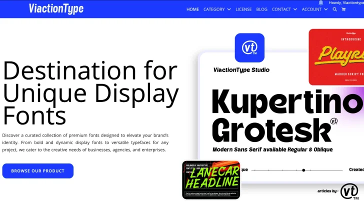
To avoid issues with fonts displaying across browsers, make sure to purchase fonts legally from official websites like ViactionType or use web fonts from libraries like Google Fonts or Adobe Fonts. This ensures consistency and prevents your website from using less desirable fallback fonts.
8. Leverage Visual Hierarchy
Typography helps establish a clear visual hierarchy, guiding users through your content. Use size, weight, and color to emphasize key elements like headings, subheadings, and call-to-action buttons. Proper hierarchy ensures that users can easily skim and understand your content.
9. Be Mindful of Text Alignment
Choose the appropriate text alignment for your content:
- Left-aligned: Best for readability, especially for body text.
- Center-aligned: Suitable for short text, headings, or promotional banners.
- Justified: Use cautiously, as it can create awkward spacing on smaller screens.
10. Test and Iterate
Typography isn’t a set-it-and-forget-it aspect of design. Continuously test your typography choices with real users and on various devices. Gather feedback and make necessary adjustments to optimize the user experience.
Final Thoughts
Typography is more than just selecting a font; it’s an integral part of effective communication in web design. By following these essential typography tips, you can create a visually appealing, readable, and user-friendly website. Remember, great typography not only enhances the aesthetic of your site but also contributes to better engagement and conversions.
For more web design tips, stay tuned to our blog and start creating designs that leave a lasting impression!