Avoid these five common typography mistakes to create better designs. Learn how to improve readability, hierarchy, and responsiveness for a professional look.

Introduction
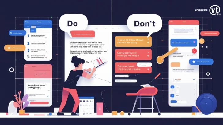
Typography plays a crucial role in design, affecting readability, aesthetics, and user experience. However, even experienced designers can make mistakes that reduce the effectiveness of their work.
In this article, we’ll discuss five common typography mistakes and how to avoid them to create visually appealing and highly readable designs.
1. Using Too Many Fonts
Why It’s a Problem
Mixing too many fonts creates inconsistency and makes a design look cluttered and unprofessional. Brands and websites should maintain a cohesive look with a limited number of fonts.
How to Avoid It
- Stick to two or three fonts:
- Primary font (for headings and brand identity)
- Secondary font (for body text)
- Optional accent font (for emphasis or decorative purposes)
- Use font pairings that complement each other (e.g., a serif font for headings and a sans-serif for body text).
- Choose fonts with multiple weights (light, regular, bold) to create variety without using too many typefaces.
2. Poor Font Readability & Legibility
Why It’s a Problem
A beautiful typeface is useless if it’s difficult to read. Poor readability frustrates users and negatively impacts engagement, especially in digital design.
How to Avoid It
- Choose the right font size:
- Print: 10pt–12pt for body text
- Web: 16px minimum for body text
- Check contrast: Ensure enough contrast between text and background (avoid light gray text on a white background).
- Avoid overly decorative or script fonts for body text: These are better suited for logos or short headlines.
- Maintain proper letter spacing (kerning & tracking): Avoid overly tight or wide spacing.
3. Ignoring Line Spacing (Leading)
Why It’s a Problem
Incorrect line spacing (leading) makes text difficult to read. Too little spacing causes crowding, while too much spacing creates disconnection between lines.
How to Avoid It
- Use 1.4x to 1.6x the font size for optimal line spacing. For example, if your font size is 16px, line spacing should be around 22px to 26px.
- Adjust leading according to the font style; some fonts require more space to breathe.
- Test readability on different devices and screen sizes.
4. Failing to Consider Hierarchy & Alignment
Why It’s a Problem
A lack of typographic hierarchy makes content overwhelming and difficult to scan. Misalignment disrupts balance and weakens design structure.
How to Avoid It
- Use font size and weight variations to establish hierarchy:
- Headings: Large and bold (e.g., 32px, 24px)
- Subheadings: Medium weight (e.g., 20px)
- Body text: Smaller, regular weight (e.g., 16px)
- Align text properly:
- Left alignment is best for readability (especially in English and other left-to-right languages).
- Avoid center-aligned text for long paragraphs.
- Use consistent margins and spacing to create a clean layout.
5. Not Optimizing Typography for Different Screens
Why It’s a Problem
Typography that looks great on a desktop may not be readable on mobile devices. Poor responsiveness leads to bad user experience and lower engagement.
How to Avoid It
- Use responsive typography: Set fonts in relative units (e.g., em, rem, vw) instead of fixed pixels.
- Implement fluid typography to scale text dynamically on different devices.
- Test typography across multiple screen sizes to ensure readability.
- Use variable fonts that adjust weight and width based on screen resolution.
Conclusion
Typography mistakes can significantly impact the effectiveness of a design. By avoiding these five common errors—using too many fonts, poor readability, incorrect spacing, lack of hierarchy, and unoptimized typography for different screens—you can create designs that are both visually appealing and user-friendly.
Good typography enhances branding, engagement, and accessibility. Always test your typography choices and refine them for the best results.