Introduction
Fonts are an essential element of graphic design, influencing the tone and readability of your work. Choosing the right font can significantly impact how your message is perceived. To make informed decisions, it’s crucial to understand the various font classifications and their unique characteristics. In this article, we’ll explore the four primary font types—serif, sans serif, script, and display fonts—along with their best applications.
1. Serif Fonts
Definition:
Serif fonts are characterized by small lines or strokes, known as “serifs,” attached to the ends of the characters.
Key Characteristics:
- Elegant and formal appearance.
- Excellent readability, especially in print.
- Associated with tradition, professionalism, and authority.
Examples:

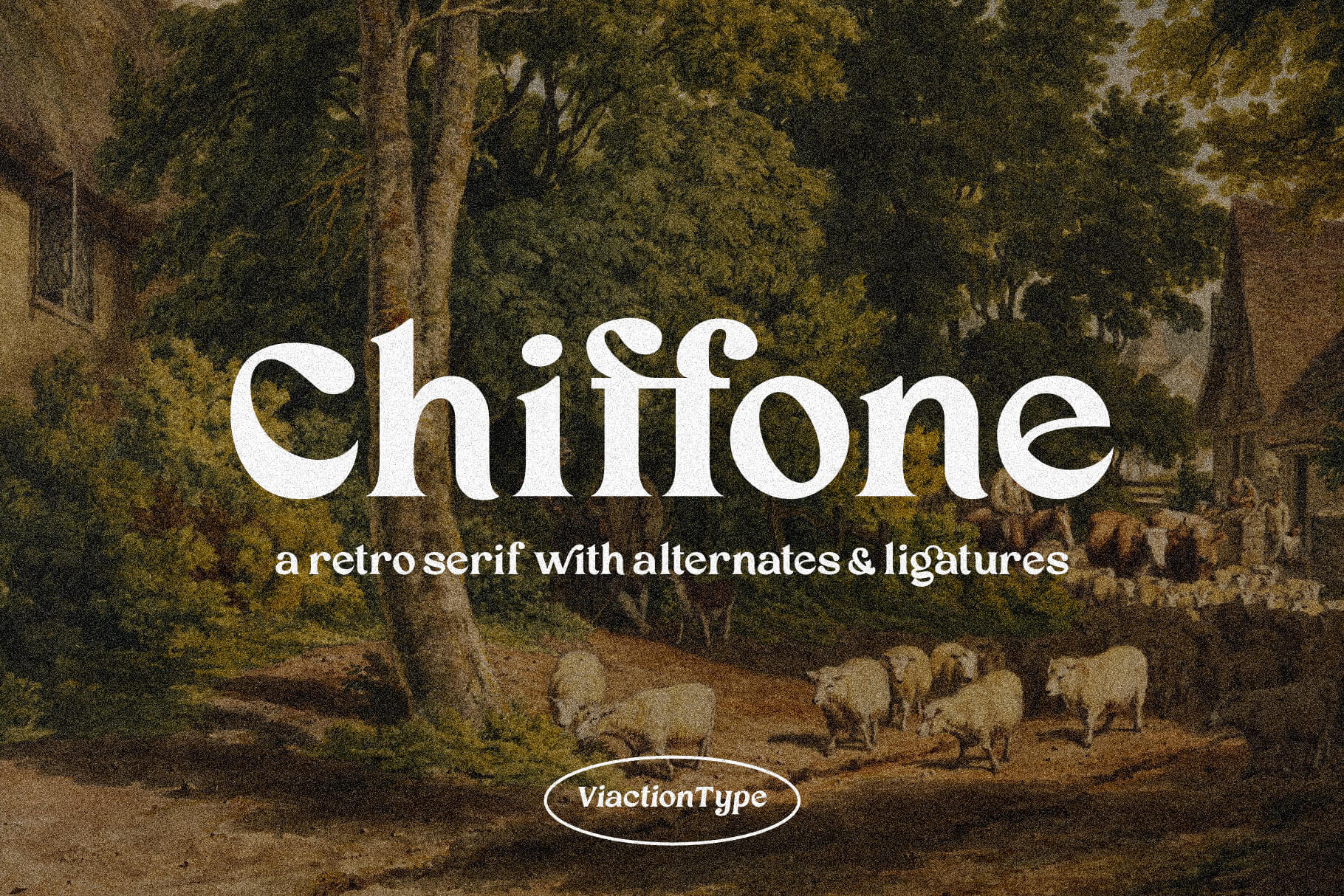
Best seller in Serif fonts
Best Uses:
Serif fonts are ideal for printed materials like books, newspapers, and formal documents. They work well in body text due to their readability.
Keywords: serif fonts, elegant fonts, professional fonts, best fonts for print
2. Sans Serif Fonts
Definition:
Sans serif fonts lack the decorative strokes at the ends of characters, giving them a clean and modern look.
Key Characteristics:
- Simple and minimalistic design.
- Highly legible on digital screens.
- Associated with modernity and clarity.
Examples:

Best seller in Sans Serif fonts
Best Uses:
These fonts are perfect for digital content, such as websites, apps, and presentations. Sans serif fonts are also popular in branding for their sleek and contemporary appeal.
Keywords: sans serif fonts, modern fonts, clean fonts, best fonts for websites
3. Script Fonts
Definition:
Script fonts mimic the fluid strokes of handwriting or calligraphy, offering an elegant and personal touch.
Key Characteristics:
- Highly decorative and artistic.
- Can range from formal to casual styles.
- Often include connected letters and flourishes.
Examples:

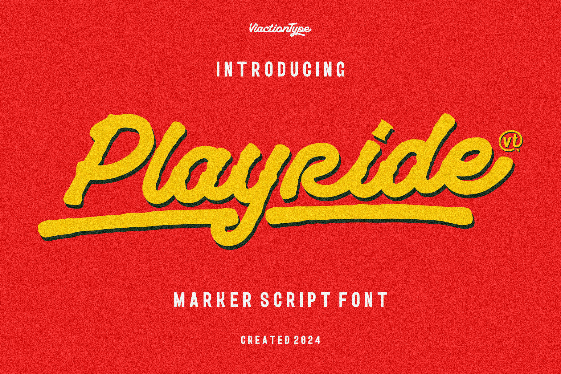
Best seller in Script fonts
Best Uses:
Script fonts are ideal for invitations, logos, and decorative purposes. However, they should be used sparingly in body text to maintain readability.
Keywords: script fonts, calligraphy fonts, decorative fonts, handwriting-style fonts
4. Display Fonts
Definition:
Display fonts are designed to grab attention, often featuring unique and dramatic styles.
Key Characteristics:
- Bold, decorative, and eye-catching.
- Used for emphasis rather than readability.
- May include quirky shapes or exaggerated features.
Examples:

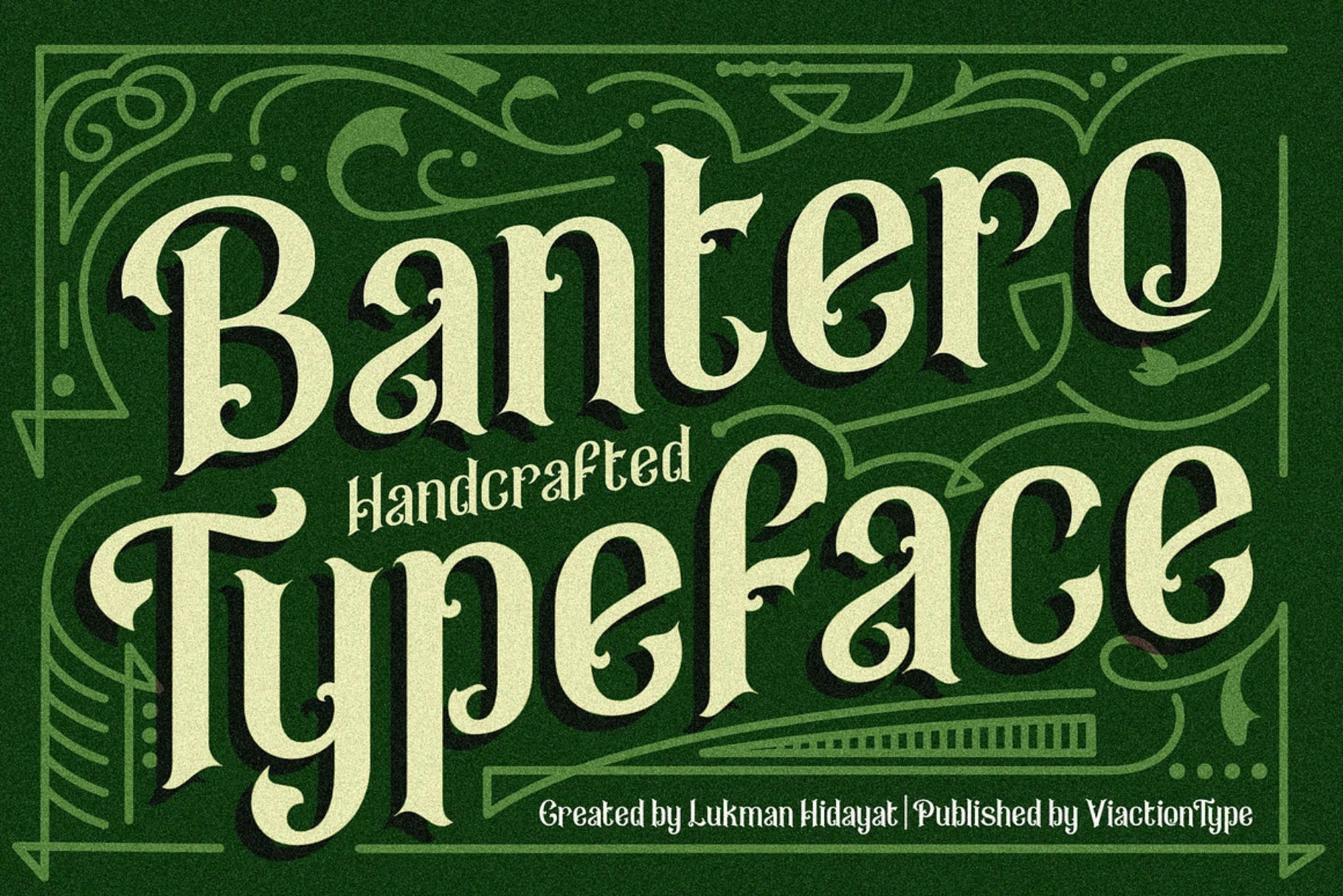
Best seller in Display fonts
Best Uses:
These fonts are suitable for headlines, posters, banners, and advertisements where the goal is to make a visual statement.
Keywords: display fonts, bold fonts, attention-grabbing fonts, best fonts for headlines
How to Choose the Right Font for Your Project
When selecting a font, consider the following:
- Purpose: Is the font for a digital platform or printed material?
- Tone: Does the font align with the mood or message of your project?
- Readability: Ensure the font is legible for its intended audience and context.
By understanding font classifications, you can create designs that are both visually appealing and aligned with your goals.
Conclusion
Fonts are more than just design elements—they communicate emotion, set the tone, and enhance the message of your content. By mastering the basics of font classification, including serif, sans serif, script, display, and monospaced fonts, you’ll be better equipped to make design choices that resonate with your audience.
Whether you’re working on a branding project, website, or formal document, selecting the right font can make all the difference. Keep these classifications in mind, and elevate your designs with confidence!

2 Comments