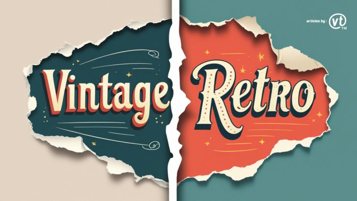
Vintage fonts vs. retro fonts—what’s the difference? Learn how these typography styles differ in aesthetics, historical influence, and best uses to enhance your branding and design projects.
Typography plays a crucial role in branding and design, with different styles evoking specific emotions and aesthetics. Two terms often used interchangeably are vintage fonts and retro fonts, but they are not the same. While both draw inspiration from the past, their stylistic approaches and historical influences differ. In this article, we’ll explore the key differences between vintage and retro fonts, helping you choose the right typeface for your next design project.
1. What Are Vintage Fonts?
Vintage fonts are typefaces that replicate historical typography styles, often inspired by design trends from the 19th and early 20th centuries. These fonts convey a sense of nostalgia, tradition, and authenticity, making them ideal for brands that emphasize heritage and craftsmanship.
Common Characteristics of Vintage Fonts:
- Classic serif or script styles
- Elegant and ornate detailing
- Weathered or distressed textures
- Inspired by print typography from newspapers, posters, and advertisements
Best Uses for Vintage Fonts:
- Logos and branding for artisanal businesses
- Packaging for heritage-inspired products
- Wedding invitations and event branding
- Packaging labels, barber shops, and handcrafted goods

Font in use : Norious Vintage Font
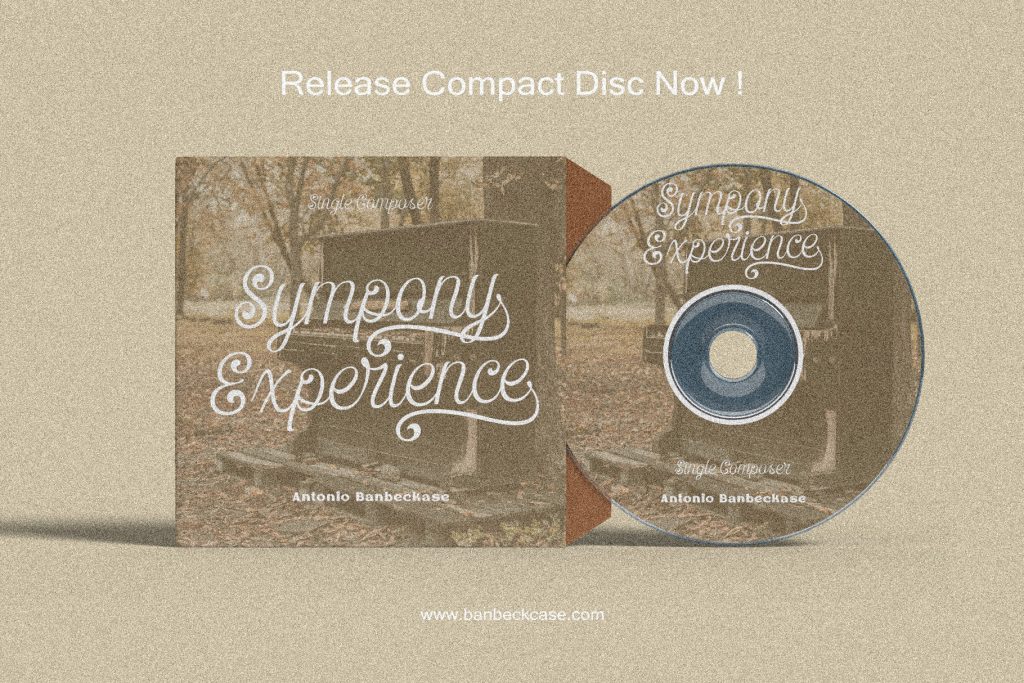
Font in use : Counter Courage

Font in use : Bantero Vintage Font
2. What Are Retro Fonts?
Retro fonts, on the other hand, are inspired by the typography and design trends of the mid-to-late 20th century, particularly from the 1950s to the 1990s. They often feature bold, colorful, and playful elements, evoking the aesthetic of specific decades.
Common Characteristics of Retro Fonts:
- Bold and geometric shapes
- Bright, eye-catching colors
- Strong, high-contrast lettering
- Often influenced by neon signs, 80s arcade games, and pop culture
Best Uses for Retro Fonts:
- Posters and advertisements with a nostalgic appeal
- Branding for vintage-inspired fashion and entertainment businesses
- Social media graphics and creative digital content
- T-shirt designs and pop culture merchandise
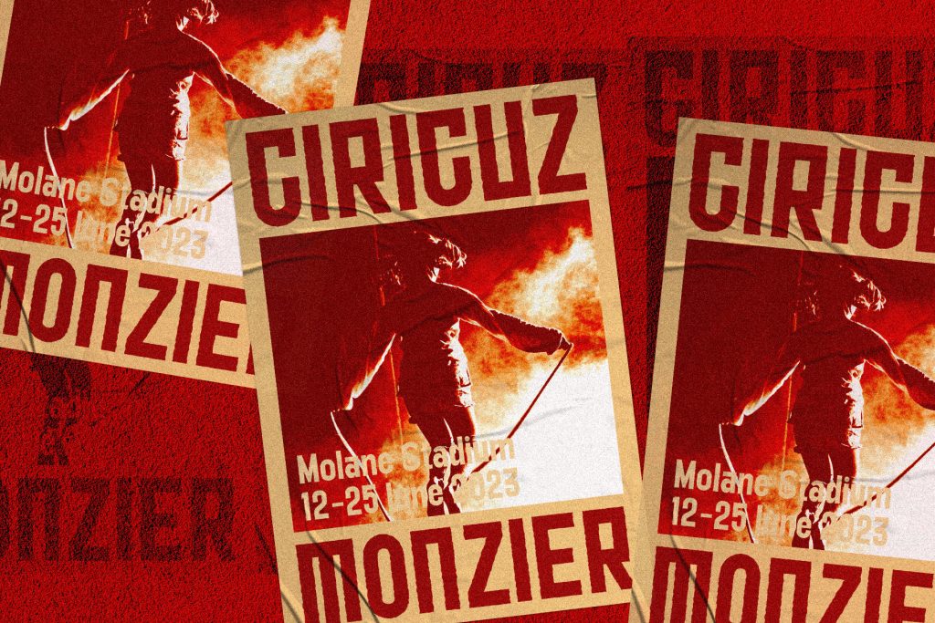
Font in use : Malonice Retro Script

Font in use : Megar Retro Reverse
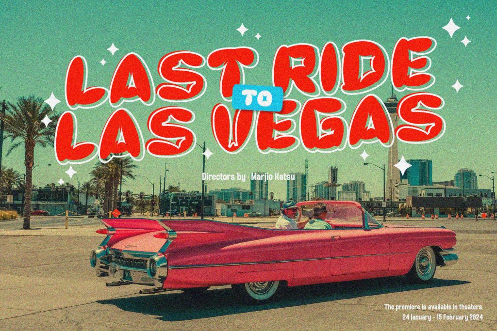
Font in use : Krico Retro Bubble
3. Key Differences Between Vintage and Retro Fonts
| Feature | Vintage Fonts | Retro Fonts |
|---|---|---|
| Time Period | 19th – early 20th century | 1950s – 1990s |
| Aesthetic Style | Elegant, classic, detailed | Bold, playful, colorful |
| Inspiration | Traditional print typography | Pop culture, neon signs, advertisements |
| Common Uses | Heritage branding, classic designs | Nostalgic, fun, and vibrant designs |
Choosing between vintage and retro fonts depends on the message you want to convey and the audience you are targeting.
- Use vintage fonts if you want to evoke elegance, heritage, and timelessness.
- Use retro fonts if you want to create a fun, nostalgic, and energetic feel.
- Combine both for a unique, eclectic style that blends past and present aesthetics.
Conclusion
Understanding the differences between vintage and retro fonts allows you to make informed design choices that align with your brand’s identity. Whether you’re aiming for old-world charm or a vibrant throwback style, selecting the right typography can elevate your designs and resonate with your target audience.