Discover the impact of typography in movie poster design! Learn how fonts, colors, and layout choices shape audience perception and enhance film marketing.
Introduction
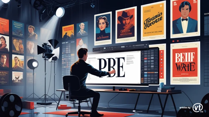
Typography plays a crucial role in movie poster design. It not only conveys essential information but also sets the tone and mood of the film. From bold block letters in action movies to elegant scripts in romantic films, typography can make or break the visual impact of a movie poster.
Why Typography Matters in Movie Posters
Typography is more than just choosing a font; it’s about creating an emotional connection with the audience. The right typography can:
- Establish the genre of the movie
- Enhance visual appeal and readability
- Reinforce branding and marketing efforts
- Influence audience perception and engagement
Key Elements of Typography in Movie Posters
1. Font Style and Genre Representation
Different genres often utilize distinct typography styles to align with the film’s theme. Some common examples include:
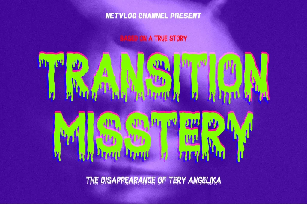
- Horror Movies: Distorted, grungy, or hand-drawn fonts that evoke fear and mystery.
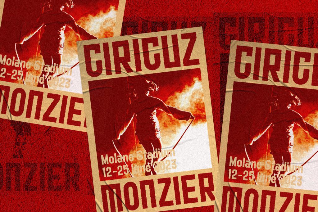
- Action & Thriller Movies: Bold, all-caps, and sharp-edged fonts that suggest intensity and excitement.
- Romantic Films: Elegant cursive or serif fonts that convey warmth and emotion.
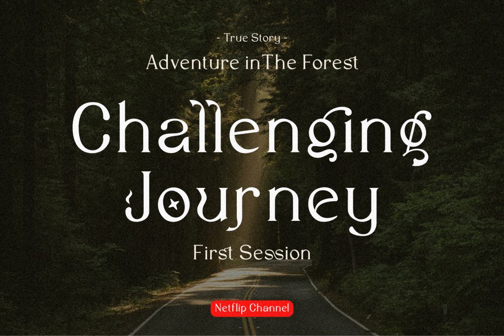
- Sci-Fi & Fantasy Movies: Futuristic or mystical fonts that immerse viewers in another world.
2. Font Size and Hierarchy
A well-structured typography hierarchy helps in guiding the audience’s attention. Common practices include:
- Movie Title: The largest and most prominent text on the poster.
- Tagline: A smaller but eye-catching font that complements the title.
- Credits and Additional Information: Often placed at the bottom in smaller fonts to maintain clarity.
3. Color and Contrast
Typography color choices should align with the poster’s overall aesthetic. For example:
- High contrast between text and background ensures readability.
- Bright colors like red or yellow for horror or thriller movies create urgency.
- Soft pastel tones in romantic movies evoke warmth and nostalgia.
4. Placement and Alignment
Strategic placement of typography ensures that it integrates seamlessly with the poster’s visuals. Some alignment techniques include:
- Centered Text: Common in dramas and biopics for a classic look.
- Diagonal or Asymmetrical Layouts: Used in action films to create a dynamic feel.
- Minimalist Approach: Often seen in indie films, using simple yet impactful typography.
Examples of Effective Typography in Movie Posters
- The Godfather (1972): The iconic serif font paired with the puppet hand logo exudes power and control.
- Jurassic Park (1993): Bold, easily recognizable typography that complements the adventure theme.
- The Social Network (2010): A clean sans-serif font that reflects the modern, tech-driven storyline.
Best Fonts for Movie Poster Design
Some widely used fonts in movie posters include:
- Yanice – Common in historical and epic movies.
- Futura – Frequently seen in sci-fi films.
- Helvetica – Popular for minimalist and contemporary designs.
- Baskerville – Ideal for drama and romance films.
Conclusion
Typography is a powerful tool in movie poster design that influences audience perception and enhances visual storytelling. By carefully selecting fonts, colors, and placement, designers can create compelling and memorable posters that attract viewers.