Discover how the psychology of fonts influences user behavior. Learn how to use typography to evoke emotions, build trust, and guide decision-making in your designs.
Typography is more than just a design element—it’s a powerful tool that can shape how users perceive and interact with your content. The fonts you choose can evoke emotions, convey trust, and even influence decision-making. In this article, we’ll explore the psychology of fonts and how typography impacts user behavior, along with practical tips to leverage this knowledge in your designs.
The Connection Between Fonts and Psychology
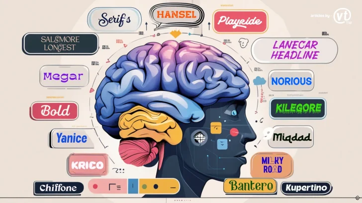
Fonts have personalities, and they communicate subtle messages to users. This is because our brains associate certain typefaces with specific emotions, traits, and experiences. For example:
- Serif fonts (e.g., Times New Roman, Antobe) often feel traditional, reliable, and authoritative.
- Sans-serif fonts (e.g., Yanice, Helvetica) convey modernity, simplicity, and cleanliness.
- Script fonts (e.g., Malonice, Pacifico) evoke creativity, elegance, and personal touch.
- Display fonts (e.g., Kupertino, Bebas Neue) are bold and attention-grabbing, often used for headlines or logos.
Understanding these associations can help you choose fonts that align with your brand’s message and influence user behavior in a meaningful way.
How Typography Influences User Behavior
- Builds Trust and Credibility
Fonts that are clean, professional, and easy to read can make your website appear more trustworthy. For example, financial institutions often use serif fonts to convey stability and reliability. - Evokes Emotions
Different fonts can trigger emotional responses. For instance, a playful, rounded font might make users feel happy and relaxed, while a bold, angular font could create a sense of urgency or excitement. - Affects Readability and Comprehension
Fonts that are difficult to read can frustrate users and lead to higher bounce rates. On the other hand, legible fonts improve comprehension and keep users engaged with your content. - Guides Decision-Making
Typography can influence how users perceive calls-to-action (CTAs). For example, a bold, attention-grabbing font on a “Buy Now” button can encourage clicks, while a subtle, elegant font might be more effective for a luxury brand. - Creates Brand Recognition
Consistent use of typography helps users recognize your brand across different platforms. Think of Coca-Cola’s iconic script font or Google’s clean sans-serif logo—these fonts are instantly recognizable and reinforce brand identity.
Practical Tips for Using Font Psychology in Design
- Align Fonts with Your Brand Personality
- If your brand is playful and fun, consider using rounded, sans-serif fonts.
- For a professional or corporate brand, opt for clean, serif fonts.
- Luxury brands often use elegant script or serif fonts to convey sophistication.
- Use Fonts to Create Hierarchy
- Use bold, large fonts for headlines to grab attention.
- Choose simpler, smaller fonts for body text to ensure readability.
- Experiment with font weights (e.g., light, regular, bold) to create contrast and guide users’ eyes.
- Consider Cultural Context
Different cultures may associate fonts with different meanings. For example, a font that feels modern in one country might seem outdated in another. Research your target audience to ensure your typography resonates with them. - Test Emotional Impact
Conduct user testing to see how your audience responds to different fonts. Ask questions like:- How does this font make you feel?
- Does it align with our brand’s message?
- Is it easy to read and understand?
- Balance Creativity with Readability
While creative fonts can make your design stand out, they should never compromise readability. Avoid overly decorative fonts for body text, and reserve them for logos or headings.
Real-World Examples of Font Psychology in Action
- The New York Times
The use of a classic serif font (Times New Roman) reinforces the newspaper’s reputation for trustworthiness and authority. - Disney
Disney’s whimsical, custom script font reflects its brand identity as a magical and creative entertainment company. - Nike
Nike’s bold, sans-serif font (Futura) conveys modernity, energy, and athleticism, aligning with its brand values.
Conclusion
Typography is a silent yet powerful communicator in design. By understanding the psychology of fonts, you can make intentional choices that influence user behavior, evoke emotions, and strengthen your brand identity. Whether you’re designing a website, creating a logo, or crafting a marketing campaign, the right typography can make all the difference.