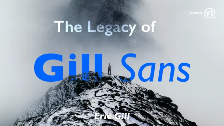
Explore the legacy of Gill Sans, the iconic British typeface designed by Eric Gill. Discover its history, design features, and enduring influence on modern design.
In the world of typography, few fonts have left as indelible a mark as Gill Sans. Designed by the British artist and typographer Eric Gill in the 1920s, Gill Sans is a quintessential humanist sans-serif typeface that has influenced design for nearly a century. Its timeless appeal, versatility, and distinctly British character have made it a favorite among designers, brands, and institutions. In this article, we’ll explore the history, design features, and enduring legacy of Gill Sans.
The Origins of Gill Sans
Gill Sans was born during a period of typographic innovation in the early 20th century. Eric Gill, a renowned sculptor, printmaker, and type designer, was inspired by the clean, geometric lines of Edward Johnston’s typeface for the London Underground. However, Gill sought to create a font that combined modernity with a humanist touch, resulting in a typeface that felt both contemporary and approachable.
The font was first released by the Monotype Corporation in 1928 and quickly gained popularity for its versatility and readability. It was one of the first sans-serif fonts to be widely adopted in Britain, marking a shift away from traditional serif typefaces.
Design Features of Gill Sans
Gill Sans is celebrated for its unique blend of geometric precision and humanist warmth. Here are some of its defining characteristics:
- Humanist Proportions: Unlike purely geometric sans-serifs like Futura, Gill Sans features subtle variations in stroke width and letter shapes, giving it a more organic and readable feel.
- Distinct Letterforms: The lowercase ‘a’ and ‘g’ are particularly distinctive, with their open, rounded shapes.
- Versatile Weights: Gill Sans comes in a wide range of weights and styles, from light to ultra-bold, making it suitable for both headlines and body text.
- British Charm: The font’s clean, understated elegance reflects the British design ethos of the early 20th century.
Gill Sans in Popular Culture
Gill Sans has been used in a variety of iconic applications, cementing its place in design history:
- British Railways: In the mid-20th century, Gill Sans became the official typeface of the British Railways, appearing on signage, timetables, and posters.
- Penguin Books: The font was used extensively by Penguin Books for their classic paperback covers, contributing to its association with literature and culture.
- BBC: The BBC adopted Gill Sans for its branding in the 1990s, further solidifying its status as a national icon.
- Modern Brands: Today, Gill Sans continues to be used by brands like Tommy Hilfiger and Premier League for its timeless appeal.
Why Gill Sans Endures
Gill Sans has stood the test of time for several reasons:
- Versatility: Its wide range of weights and styles makes it suitable for everything from corporate branding to editorial design.
- Readability: The humanist design ensures that it remains highly readable, even at small sizes.
- Cultural Significance: As a symbol of British design, Gill Sans carries a sense of heritage and authenticity.
- Timeless Aesthetic: Its clean, elegant lines make it feel modern even decades after its creation.
Criticism and Controversy
Despite its widespread acclaim, Gill Sans is not without its critics. Some designers argue that its overuse has made it feel generic, while others point to the controversial life of its creator, Eric Gill, whose personal actions have sparked debates about separating art from the artist. However, the font’s enduring popularity suggests that its design merits continue to outweigh these concerns.
How to Use Gill Sans in Modern Design
If you’re considering using Gill Sans in your projects, here are some tips:
- Pairing: Combine Gill Sans with serif fonts like Baskerville or Chiffone for a classic, balanced look.
- Branding: Use it for logos, packaging, or corporate materials to convey trustworthiness and elegance.
- Editorial Design: Its readability makes it ideal for books, magazines, and websites.
- Contrast: Experiment with different weights and sizes to create visual hierarchy.
Conclusion
Gill Sans is more than just a font; it’s a cultural icon that has shaped the visual landscape of the 20th and 21st centuries. Its unique blend of modernity and humanity, combined with its rich history, ensures that it remains a beloved choice for designers around the world. Whether you’re designing a logo, a book, or a website, Gill Sans offers a timeless elegance that few other typefaces can match.