
Serif vs. sans-serif fonts: which one is best for your project? Learn the key differences, best use cases, and expert tips on typography selection.

Introduction
Choosing the right typeface is a crucial decision in any design project. The debate between serif vs. sans-serif fontshas been ongoing for decades, with each style offering unique advantages. But which one is the best choice for your project?
In this article, we’ll explore the key differences between serif and sans-serif fonts, their impact on readability, branding, and where each typeface works best.
1. What Are Serif and Sans-Serif Fonts?
Before deciding which typeface to use, it’s important to understand their characteristics.
What Are Serif Fonts?
Serif fonts have small decorative strokes (serifs) at the ends of letters. These details give the text a more traditional and formal look.
Examples of Serif Fonts:
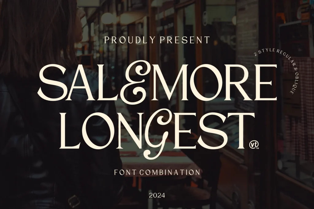
- Salemore Longest
- Chiffone
- Georgia
- Baskerville
Characteristics of Serif Fonts:
✔ Classic and elegant appearance
✔ Improves readability in print
✔ Conveys professionalism and trust
What Are Sans-Serif Fonts?
Sans-serif fonts lack decorative strokes, resulting in a clean and modern design. They are widely used for digital content because of their simplicity.
Examples of Sans-Serif Fonts:
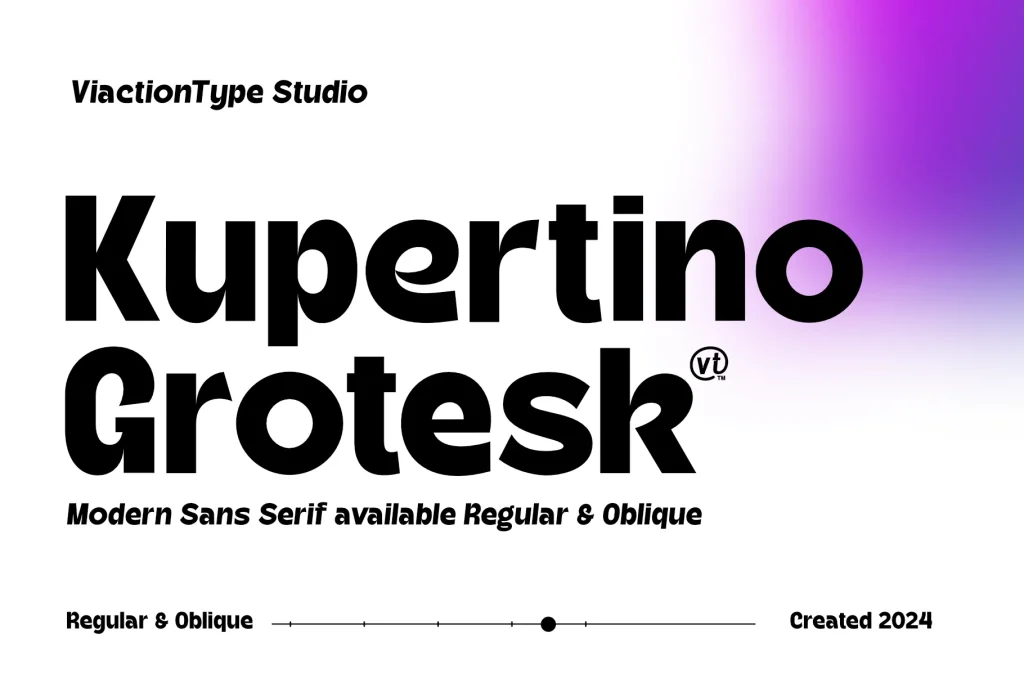
- Kupertino Grotesk
- Yanice
- Futura
- Montserrat
Characteristics of Sans-Serif Fonts:
✔ Modern and minimalistic look
✔ More readable on digital screens
✔ Conveys a sense of simplicity and innovation
2. Serif vs. Sans-Serif: Key Differences
| Feature | Serif Fonts | Sans-Serif Fonts |
|---|---|---|
| Appearance | Classic, formal, and detailed | Clean, modern, and minimalistic |
| Readability | Better for print (books, newspapers) | Better for digital (web, mobile apps) |
| Brand Personality | Traditional, professional, trustworthy | Contemporary, friendly, approachable |
| Best Used For | Books, newspapers, legal documents, luxury brands | Websites, apps, tech brands, modern advertisements |
3. When to Use Serif Fonts
Serif fonts are ideal when you want to convey elegance, reliability, and tradition.
Best Use Cases for Serif Fonts:
✅ Print Media: Books, newspapers, and magazines (e.g., The New York Times)
✅ Luxury & High-End Brands: Fashion, jewelry, and premium products (e.g., Vogue)
✅ Corporate & Legal Documents: Law firms, banks, and financial institutions (e.g., The Wall Street Journal)
Example:
A law firm should use a serif font like Garamond or Times New Roman to establish professionalism and trustworthiness.
4. When to Use Sans-Serif Fonts
Sans-serif fonts work well for brands that aim for modernity, clarity, and accessibility.
Best Use Cases for Sans-Serif Fonts:
✅ Web & Digital Design: Websites, mobile apps, and UI/UX design (e.g., Google, Facebook)
✅ Tech & Startups: Software companies, fintech, and modern brands (e.g., Apple, Airbnb)
✅ Minimalist & Trendy Brands: Fashion, lifestyle, and creative businesses (e.g., Spotify)
Example:
A tech startup should use a sans-serif font like Montserrat or Helvetica to convey innovation and a modern brand image.
5. Should You Mix Serif and Sans-Serif Fonts?
Yes! Combining serif and sans-serif fonts can create contrast and hierarchy in design.
Tips for Pairing Serif and Sans-Serif Fonts:
- Use serif for headings and sans-serif for body text (great for blogs and magazines).
- Match font personalities—a classic serif pairs well with a clean, modern sans-serif.
- Avoid using fonts that are too similar (e.g., don’t pair two sans-serif fonts).
Great Font Pairing Examples:
- Playfair Display (Serif) + Lato (Sans-Serif)
- Georgia (Serif) + Montserrat (Sans-Serif)
6. The Future of Typography: Which One Will Dominate?
The rise of variable fonts and responsive typography means both serif and sans-serif fonts will continue to evolve. While sans-serif dominates digital platforms, serif fonts remain strong in branding and print.
However, many brands are experimenting with modernized serif fonts for a fresh, hybrid look. This trend shows that typography choices will remain versatile and adaptable.
Conclusion
Choosing between serif vs. sans-serif fonts depends on your project’s medium, audience, and brand personality.
- Use serif fonts for traditional, trustworthy, and professional branding.
- Use sans-serif fonts for modern, digital-friendly, and minimalist designs.
- Combine both for contrast and visual balance.