Discover how typography influences emotion and consumer behavior. Learn how font choice affects brand perception, trust, and audience response in modern design.
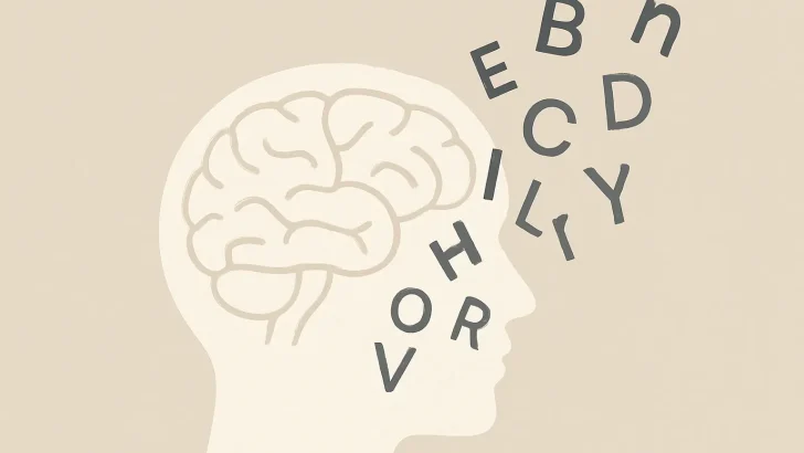
Typography isn’t just about making words readable — it’s about making them feel.
Every curve, weight, and spacing choice in a font communicates subtle emotional cues that can dramatically shape how audiences respond to a design.
From luxury brands that whisper sophistication to playful startups that radiate energy, typography has the power to influence emotion and behavior — often before the viewer even processes the message.
Let’s explore how and why it works.
1. First Impressions Happen in Milliseconds
Studies in visual psychology show that people form an emotional impression of a design in under 100 milliseconds.
That means typography — not just words — often delivers the first emotional signal.
-
Rounded sans-serifs (like Poppins or Avenir) feel friendly and modern.
-
Sharp serifs (like Times New Roman or Garamond) evoke tradition and authority.
-
Geometric typefaces feel clean, balanced, and reliable.
Your font choice can either invite a viewer in or push them away instantly.
2. Fonts Create Personality — Even Without Words
Typography acts as visual tone of voice.
Just as a speaker’s tone changes meaning, fonts alter how written words are perceived.
Compare these phrases:
-
“Welcome to our store” in a thin, elegant serif → feels premium and refined.
-
“Welcome to our store” in a bold, chunky sans-serif → feels casual and fun.
Even though the message is identical, the emotion shifts completely.
That’s why successful brands carefully align their typefaces with their voice — a mismatch between tone and typography breaks trust.
3. The Psychology of Shapes in Type
The emotional impact of typography is often subconscious — rooted in how the human brain associates shapes and emotions.
| Typeface Feature | Emotional Association | Example Fonts |
|---|---|---|
| Rounded Edges | Softness, friendliness | Nunito, Quicksand |
| Sharp Angles | Strength, confidence | Bebas Neue, Playfair Display |
| Tall, Narrow Letters | Elegance, professionalism | Didot, Lora |
| Wide Letters | Stability, openness | Montserrat, Futura |
Understanding these shape-based emotions helps designers craft visual experiences that connect deeper with audiences.
4. Typography Guides Decision-Making
Beyond emotion, typography also affects behavior.
UX studies show that certain type choices can:
-
Encourage trust (clear, legible fonts in financial or medical design)
-
Prompt faster actions (bold, easy-to-read sans-serifs in CTAs)
-
Increase reading time (serifs in long-form editorial or storytelling content)
This is why tech companies tend to prefer clean, neutral sans-serifs, while publishers and luxury brands still lean on serif typography for narrative depth.
5. The Emotional Future of Fonts
As AI and personalization advance, the next frontier of typography may involve emotionally adaptive design — fonts that subtly change weight, width, or tone based on user context or mood.
Imagine a reading app that softens its typography at night to create a calmer experience, or an AI branding tool that picks typefaces based on emotional resonance rather than visual similarity.
Typography’s role in emotional design is only going to grow stronger.
Final Thoughts
Typography is more than design decoration — it’s a psychological language.
When used intentionally, it builds trust, inspires action, and creates unforgettable brand experiences.