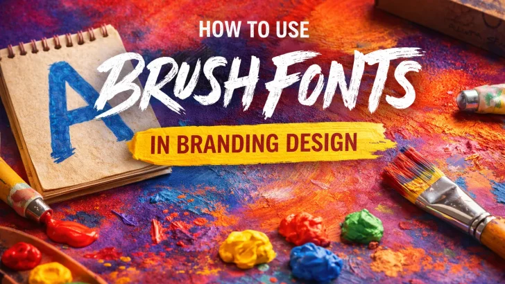
Learn how to use brush fonts effectively in branding design to create bold, authentic, and expressive brand identities with handcrafted typography.
Brush fonts have become a powerful visual tool in modern branding. In an era dominated by clean, minimal, and AI-generated typography, brush fonts bring something refreshingly human—emotion, energy, and authenticity.
However, using brush fonts effectively in branding requires strategy. When applied correctly, they can elevate brand identity. When misused, they can feel chaotic or unprofessional. This article explores how designers can maximize the impact of brush fonts in branding design.
Why Brush Fonts Work in Branding
Brush fonts are rooted in hand-drawn lettering, making them ideal for brands that want to communicate personality and emotion. Their natural imperfections and bold strokes help brands feel more relatable and expressive.
Brush fonts are especially effective for brands that want to appear:
-
creative and expressive
-
bold and confident
-
handcrafted and authentic
-
youthful and energetic
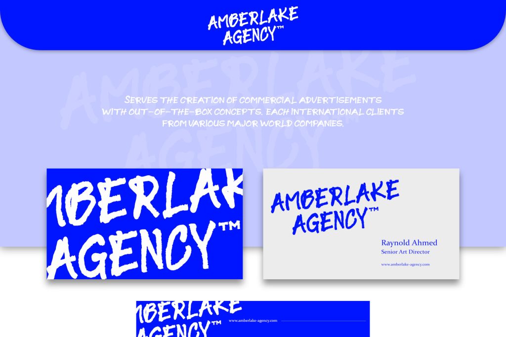
Borlasino Font
This is why brush typography is widely used in lifestyle brands, fashion, food & beverage, music, and creative industries.
Choose the Right Brush Font Personality
Not all brush fonts convey the same message. Some feel wild and aggressive, while others feel elegant or artistic. Before choosing a brush font, designers should align the font’s character with the brand’s personality.
For example:
-
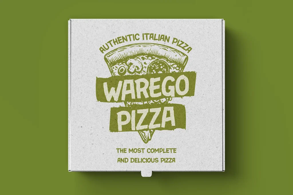
Bold, textured brush fonts work well for streetwear, coffee brands, and event posters
-
Refined brush lettering styles suit boutique brands and creative studios
-
Vintage-inspired brush fonts support retro branding and heritage storytelling
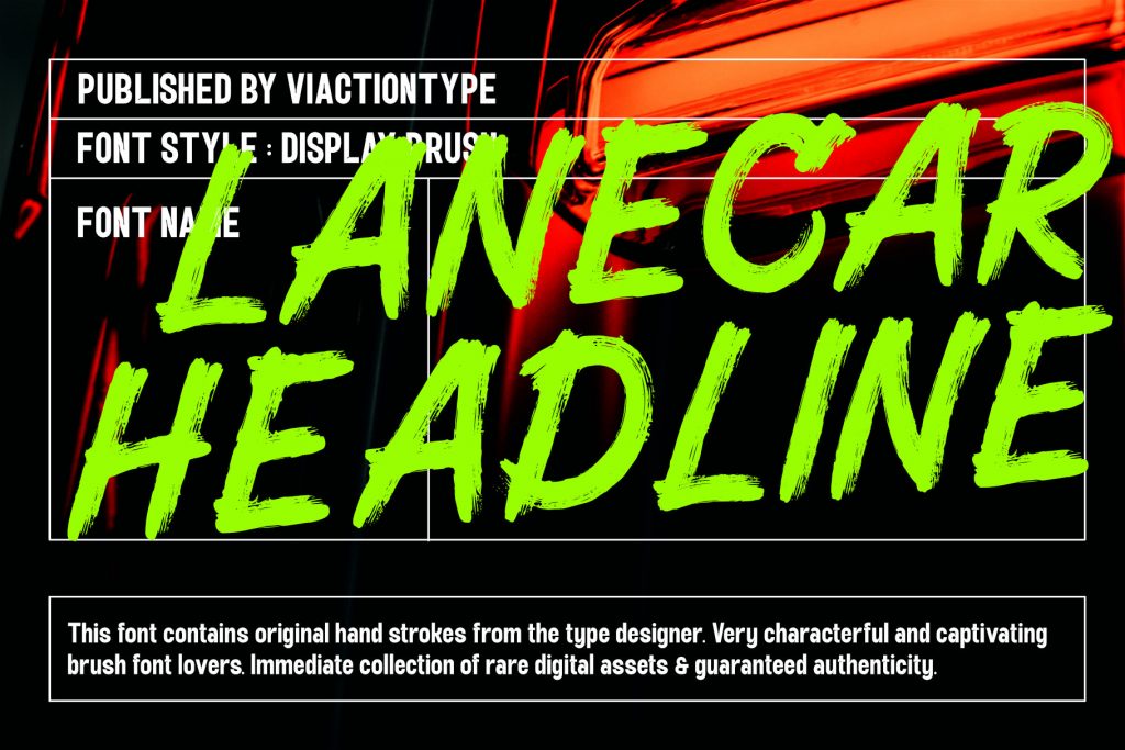
Lanecar Headline Font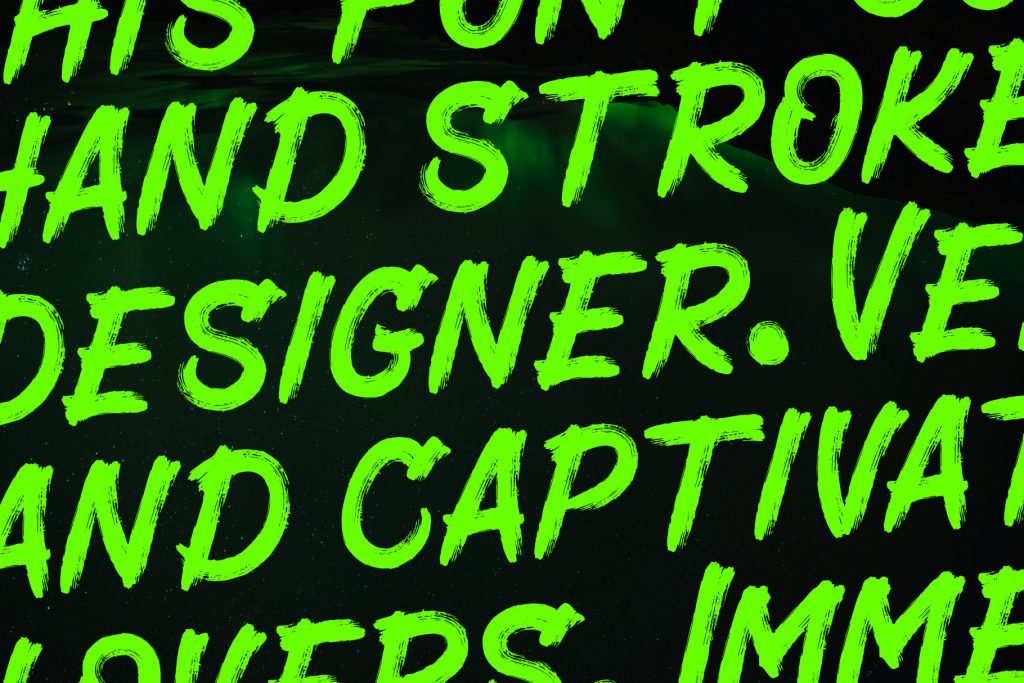
A handcrafted brush font like Borlasino delivers strong movement and organic texture, making it ideal for expressive branding statements.
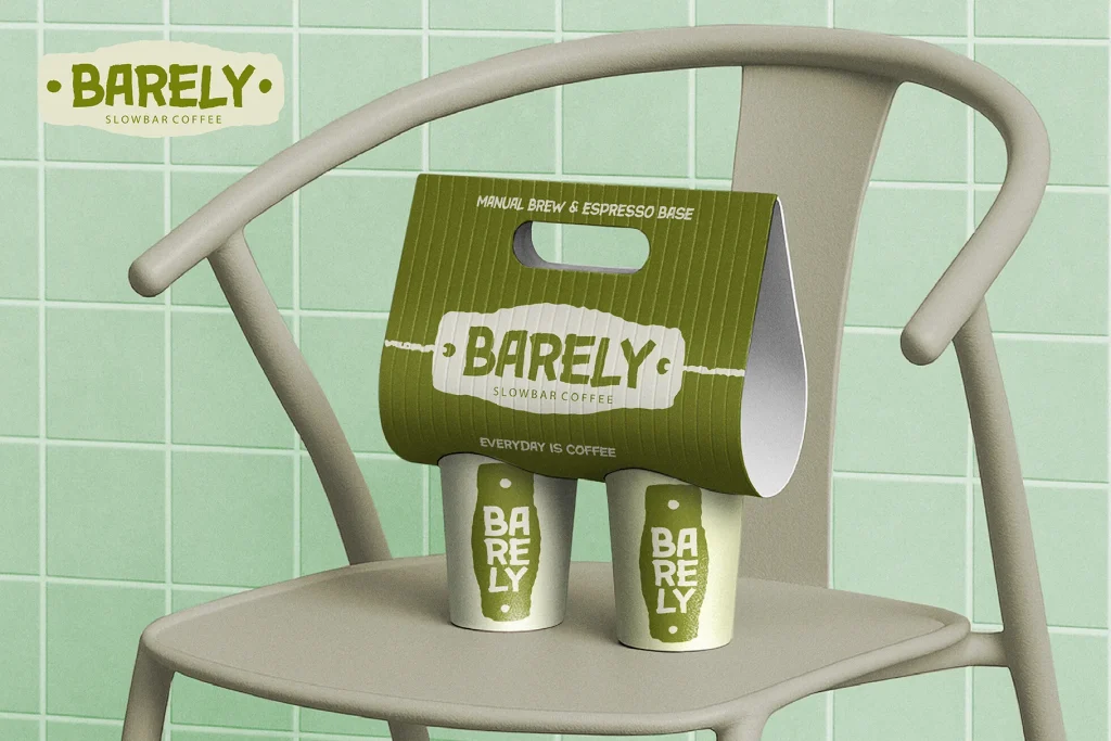
Use Brush Fonts as Accent, Not Everything
One of the most common mistakes in branding is overusing brush fonts. Because of their strong visual presence, brush fonts work best as accent typography.
Best practices include:
-
using brush fonts for logos or brand marks
-
applying them to headlines, slogans, or key messages
-
pairing them with clean sans-serif or serif fonts for body text
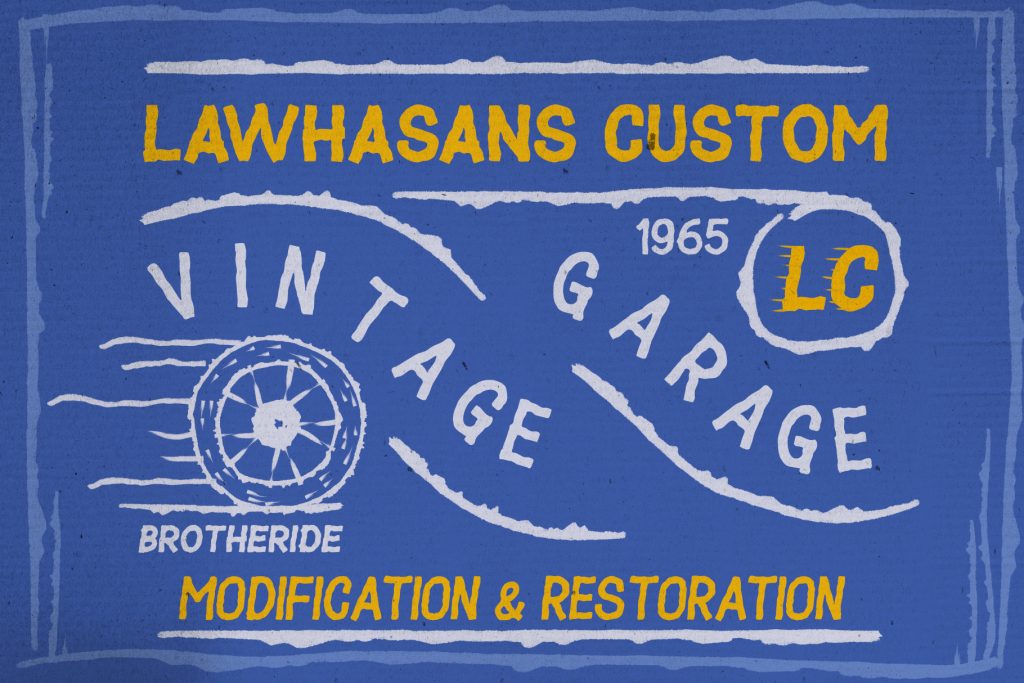
Playride Font
This balance keeps the branding readable while allowing the brush font to shine.
Pair Brush Fonts with the Right Supporting Fonts
Font pairing is critical in branding. Brush fonts pair best with neutral, simple typefaces that don’t compete visually.
Effective pairings include:
-
brush font + geometric sans-serif
-
brush font + clean grotesk font
-
brush font + minimal serif
Creamy Cookies Font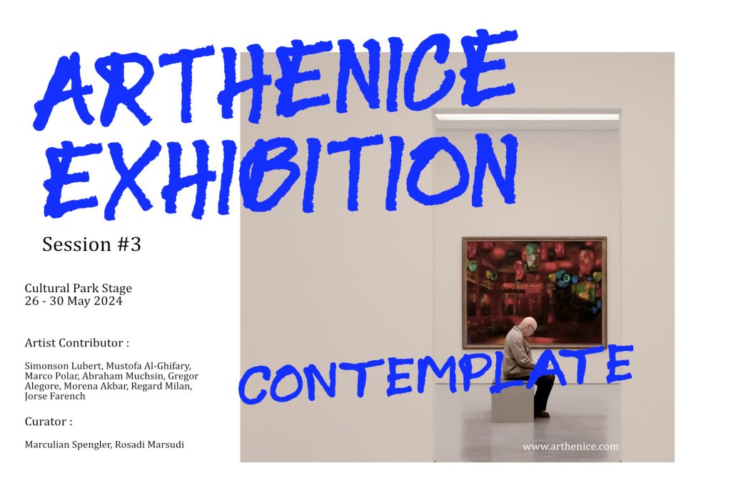
This contrast enhances hierarchy and ensures brand materials remain professional and versatile across platforms.
Leverage Texture and Imperfection for Authenticity
One of the greatest strengths of brush fonts is their organic texture. Visible brush grain, uneven edges, and stroke variation add depth and realism to branding visuals.
In today’s market, these imperfections signal:
-
human craftsmanship
-
originality
-
emotional warmth
-
premium handcrafted value
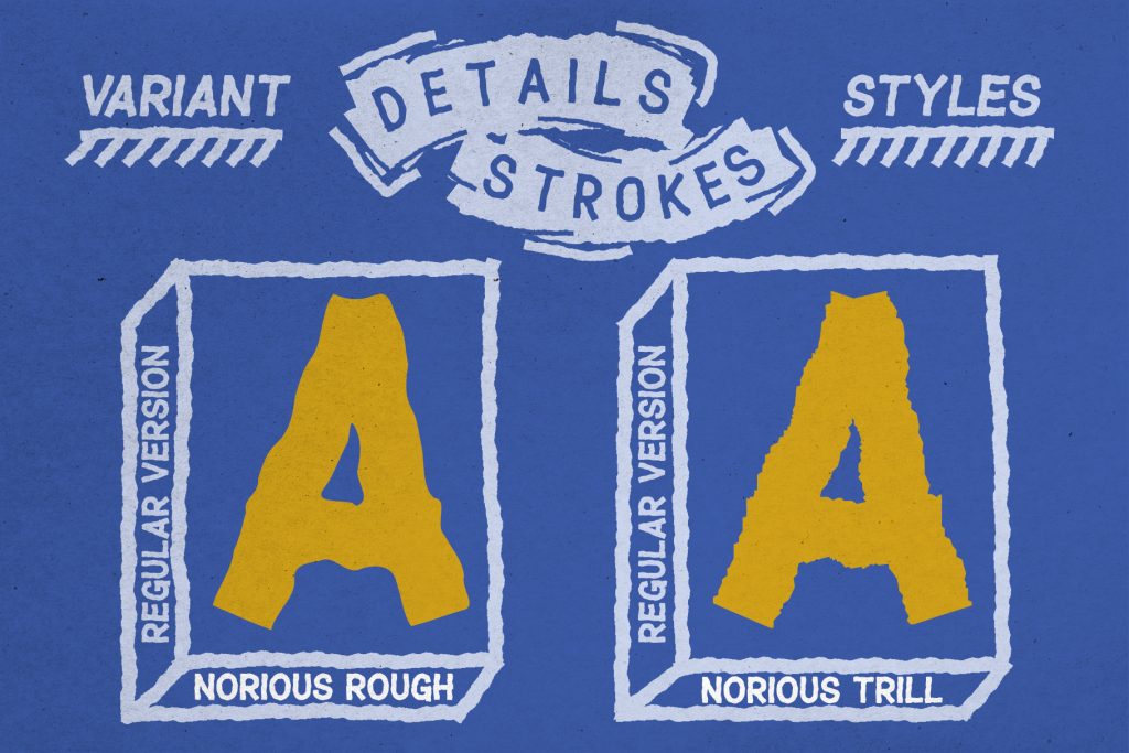
Norious Font
This makes brush fonts ideal for brands that want to stand apart from overly polished, generic designs.
Apply Brush Fonts Strategically Across Brand Touchpoints
To maintain consistency, brush fonts should be used intentionally across brand assets such as:
-
logos and packaging
-
posters and promotional graphics
-
social media visuals
-
merchandise and apparel
Consistency builds recognition, while strategic placement ensures the font enhances—not overwhelms—the brand identity.
Final Thoughts: Brush Fonts as a Branding Asset
Brush fonts are more than decorative typefaces—they are branding tools. When used thoughtfully, they communicate emotion, authenticity, and creative confidence.
By choosing the right brush font, pairing it wisely, and applying it strategically, designers can create branding that feels bold, human, and memorable. In a digital world filled with perfection, brush fonts remind audiences that imperfection is powerful.