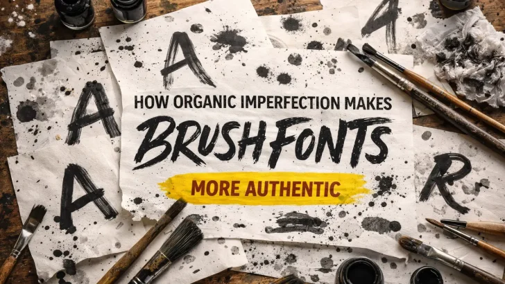
Discover how organic imperfection gives brush fonts authenticity, emotional depth, and a handcrafted feel that stands out in modern design and branding.
In a digital era dominated by precision and automation, imperfection has become a powerful design statement. Brush fonts—known for their rough edges, uneven strokes, and handcrafted textures—stand out precisely because they break away from digital perfection. These organic imperfections give brush fonts their authenticity, emotional depth, and timeless appeal.
This article explores why organic imperfection is essential to brush fonts, how it enhances visual storytelling, and why designers continue to choose imperfect lettering in modern branding and creative projects.
The Rise of Authenticity in Design
Today’s audiences crave authenticity. Brands no longer want to look overly polished or corporate—they want to feel human, honest, and relatable. This shift has pushed designers toward handcrafted aesthetics, including brush lettering and hand-drawn typography.
Organic imperfection reflects real human movement: pressure changes, uneven rhythm, accidental splashes, and raw texture. These details communicate emotion in ways that perfectly aligned vector fonts simply cannot.
What Makes Brush Fonts “Organically Imperfect”?
Brush fonts are typically created using real tools—brushes, markers, or ink—before being digitized. This process naturally introduces imperfections such as:
-
Irregular stroke widths
-
Rough or textured edges
-
Inconsistent letter shapes
-
Natural ink bleed and brush drag
Rather than flaws, these characteristics become visual signatures of authenticity.
Read Also : Borlasino Brush Font: When Bold Movement Meets Handcrafted Texture
Why Imperfection Feels More Authentic
-
Human Touch Over Machine Precision
Imperfect strokes signal that a real person was involved in the creative process. This human touch builds emotional connection and trust. -
Visual Energy and Movement
Uneven brush strokes create rhythm and motion, making typography feel alive and expressive. -
Uniqueness in Every Letter
No two characters look exactly the same, reinforcing originality and handcrafted value—especially important in a market saturated with AI-generated visuals. -
Emotional Storytelling
Organic imperfections can feel bold, rebellious, nostalgic, or raw—perfect for storytelling-driven design.
Brush Fonts vs Clean Digital Typefaces
While clean sans-serif fonts excel in clarity and UI design, brush fonts shine in expressive and personality-driven contexts. They are often used for:
-
Branding and logo design
-
Poster and album artwork
-
Packaging and label design
-
Social media graphics
-
Apparel and merchandise
In these cases, emotional impact matters more than technical perfection.
Imperfection as a Branding Advantage
Brands that use brush fonts often want to communicate values like creativity, craftsmanship, freedom, or heritage. Organic typography helps brands:
-
Appear more approachable and genuine
-
Stand out visually in competitive markets
-
Reinforce handmade or artisanal positioning
This is why brush fonts are popular in industries such as coffee, fashion, music, food & beverage, and creative startups.
The Role of Imperfection in the Age of AI
As AI-generated fonts and designs become more common, organic imperfection becomes even more valuable. Handcrafted brush fonts offer something AI still struggles to replicate convincingly: intentional inconsistency and emotional nuance.
Designers who embrace imperfection can differentiate their work and maintain originality in an increasingly automated design landscape.
Conclusion: Imperfection Is the New Authenticity
Organic imperfection is not a weakness—it is the soul of brush fonts. The rough textures, uneven strokes, and raw energy give brush typography its authentic voice. In a world of flawless digital outputs, imperfect brush fonts remind us that real creativity is human, expressive, and beautifully flawed.
For designers and brands seeking authenticity, brush fonts with organic imperfections remain an essential creative tool.