
Learn how to choose the perfect font for your brand identity. Discover typography tips, font psychology, and browse premium fonts to elevate your branding.
Introduction
Choosing the perfect font for your brand identity is more than just a design decision—it’s a strategic move that defines how your audience perceives your business.
Typography communicates emotion, builds trust, and influences purchasing decisions. Whether you’re creating a logo, website, or marketing materials, the right font can elevate your brand instantly.
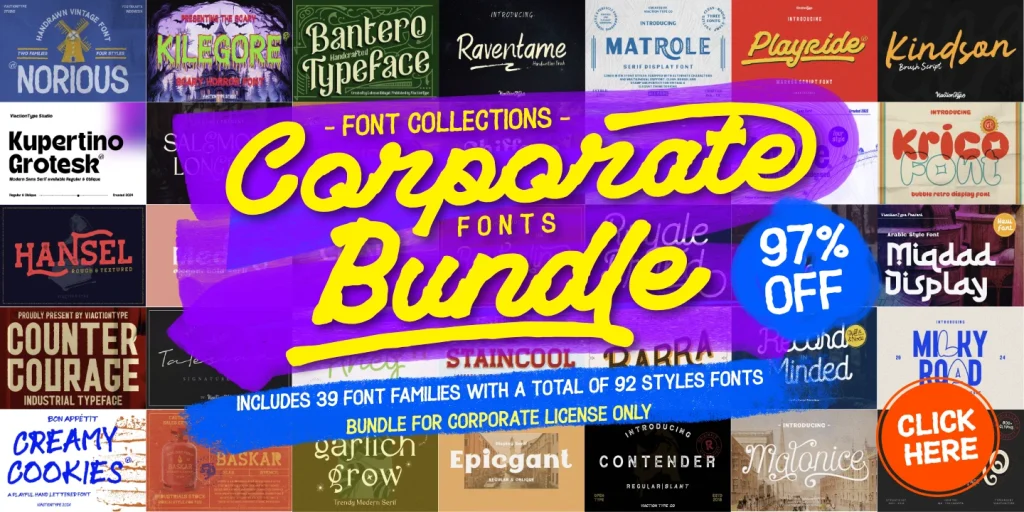
👉 Looking for high-quality fonts? Browse our premium font collection to find the perfect match for your brand.
1. Understand Your Brand Personality
Before selecting a font, you need to clearly define your brand personality.
Ask yourself:
- Is your brand modern or classic?
- Is it playful or professional?
- Is it luxurious or minimal?
Font styles and brand perception:
- Serif fonts → Trustworthy, traditional, elegant
- Sans serif fonts → Clean, modern, approachable
- Script fonts → Personal, creative, luxurious
- Display fonts → Unique, bold, expressive
Your font should reflect your brand voice consistently across all platforms.
👉 Explore our premium fonts to match your brand personality perfectly.
2. Prioritize Readability and Functionality
A beautiful font is useless if it’s hard to read.
Best practices:
- Use clean fonts for body text
- Avoid overly decorative styles for long paragraphs
- Test fonts on different screen sizes
- Ensure clarity on both desktop and mobile
Readability is especially important for websites, where users scan content quickly.
3. Choose the Right Font for Each Purpose
Different parts of your brand require different font roles.
Common font roles:
- Logo font → Unique and memorable
- Heading font → Bold and attention-grabbing
- Body font → Simple and highly readable
Using the same font everywhere can make your design feel flat. Instead, create contrast while maintaining harmony.
4. Master Font Pairing
Font pairing is key to a professional-looking brand.
Effective pairing strategies:
- Serif + Sans Serif
- Bold headline + neutral body text
- Decorative + minimalist
Avoid using more than 2–3 fonts to maintain consistency.
👉 Need help pairing fonts? Discover our curated font combinations in our premium collection.
5. Consider Brand Consistency
Consistency builds recognition.
Your fonts should be used consistently across:
- Website
- Social media
- Packaging
- Marketing materials
A consistent typography system strengthens your brand identity and builds trust with your audience.
6. Think About Scalability and Versatility
Your font should work in multiple contexts:
- Small text (mobile screens)
- Large headlines
- Print materials
Choose fonts that remain clear and effective in all sizes.
7. Use High-Quality and Licensed Fonts
Using free or low-quality fonts can hurt your brand image.
Premium fonts offer:
- Better design quality
- More glyphs and features
- Professional appearance
- Licensing for commercial use
👉 Upgrade your branding with premium fonts designed for professionals.
Build a Strong Brand with the Right Font
Your font is your brand’s voice—make sure it speaks clearly and professionally.
- Modern & unique styles
- Perfect for logos and branding
- Optimized for web and print
🚀 Start building a powerful brand identity today with our premium font collection.